Courtesy of Doug Short.
Yesterday I posted my analysis of selected features in Sentier Research‘s new report on the general decline in median household incomes since the end of the Great Recession in June 2009. My focus was on real income change by age groups and by racial/ethnic categories (more here). Today I’ll examine the real income changes by household type and educational attainment.
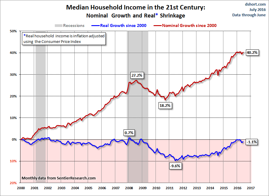
According to Sentier Research’s latest press release (available as a PDF), real (inflation-adjusted) median household annual income is down 3.1% since the economic recovery began in June 2009. It is 4.8% below its level at the December 2007 recession start.
For the larger context here is a look at nominal and real (inflation adjusted) median household income since the turn of the century based on Sentier Research’s monthly reports of the real, seasonally adjusted data.
Additional charts and a discussion of this 21st century timeframe are available at this permanent link, which I update monthly.
The Distribution by Type of Household
Households are subdivided into two broad categories: Family and Nonfamily, which have a ratio of about two-to-one of all households. Family households are divided into three categories: Married, Female householder with children present, and Other family households.
Nonfamily Households are broken into two easily understood categories — “Women living alone” and “Men living alone” — and a third and much smaller “Other nonfamily” catch-all.
The table below shows the number of households per type and the real (inflation-adjusted) median annual income in June 2009 and the equivalent data for June 2014.

The column chart below gives us a visualization of the comparative growth in the number of households by category (married couples being the one exception that showed essentially no growth). I’ve circled “All Households” and its two broad subcategories.

Married couples constituted an even 50.0% of “All Households” in June 2009. Five years later it dropped to 47.8%. The 16.1% growth in “Other family households” is no doubt attributable in part to adult family members who moved back home in the wake of the post-recession financial stresses.
A snapshot of changes in income shows varying degrees of shrinkage across the board.

With the -2.8% decline as the “All Household” benchmark, we see the deepest declines the two broad Nonfamily Households: “Women living alone” and “Men living alone”. Interestingly enough, it is the “Men living alone” category that has fared the worst, with a 7.1% decline in real annual income 60 months following the recession’s end.
The Distribution by the Educational Attainment of the Householder
The next table focuses on the educational attainment of the householder (the named owner or renter of the dwelling).

At first glance, a column chart of the percent changes in real median incomes appears to make no sense. All levels of educational attainment are significantly lower than the “All Households” -2.8% benchmark.

There are some complex contributors to this counterintuitive array of declines. But we get some clues when we look at the shift in numbers for attainment levels.

The Sentier Research report offers the following observation:
| The percentage declines in median income for each educational category were significantly larger than the decline in median income for all households (2.8 percent). This occurred because between June 2009 and June 2014 there was a pronounced increase in the proportion of households with higher levels of education, which exerted upward influence on the overall median household income. |
I would also point out that a major contributor to the median income declines by educational attainment is the income lost while participating in the educational activities (back to school, online courses, etc.) required for achieving a higher educational attainment.
Here is a chart of federal loans to students that I update quarterly from the Fed Flow of Funds report.

Student loans have skyrocketed since the June 2009 starting point of the Sentier Research report. In fact, as I point out in my quarterly analysis of the Fed’s balance sheet, student loans are by far Uncle Sam’s largest asset.
Of course, we can’t determine precisely the percentage of loans taken out by people who reduced or stopped income earning activities to improve their educational attainment. But the unprecedented trend in new loans fits well with the Sentier Research findings on educational attainment.
I’ll conclude this commentary by pointing out that there is additional fascinating information in the Sentier Research report itself:
- Household Income on the Fifth Anniversary of the Economic Recovery:
June 2009 to June 2014
Anyone interested should study the full report, which is available for a small fee here on the Sentier Research website.


