

Courtesy of Doug Short.
The Census Bureau’s annual household income reports for 2013 were published this week. I’ve now compiled a few tables for the 50 states and DC based on the Current Population Survey, a joint undertaking of the Census Bureau and Bureau of Labor Statistics, which includes annual data from 1984 to 2013. The details are fascinating, if somewhat sobering.
First, some context. The median US income in 2013 was $51,939, up from $22,415 in 1984 — a 131.7% rise over the 29-year timeframe. However, if we adjust for inflation chained in 2013 dollars, the 1984 median is $47,866, and the increase drops to 8.5%.
The Latest Data and Peak Income Years
The peak annual median income for the US, adjusted for inflation, was in 1999. The latest data point, fourteen years later — after two recessions and two market crashes — is down 8.7%. Here is a alphabetically sorted table showing the data for the 50 states and DC along with the US median data.

The alphabetical listing above makes it easy to find individual states, but for some additional insight, let’s sort the data based on the decline from the peak year.

The median household incomes in 17 states plus DC have fared better than the US median as measured by the real percent declines from their respective peak years. A total of 33 states have suffered greater declines, with eight states dropping more than 20%, up from four in the 2012 data. Nevada is the biggest loser, down a whopping 26.7% since its real median income peak in 2000.
Highest to Lowest Median Incomes
The next table sorts the data by the 2013 median income column. A quick look at this table shows the huge spread between the $71.3K median in New Hampshire and the $39.6K in Louisiana. Of course, the cost of living is a critical factor in comparisons of the raw data, a topic I’ll address in a separate commentary.

For an idea of the geographical distribution of median incomes, here is a map that color codes the states based on a quintile breakdown.

For the sake of comparison, here is the comparable map for the year 1984, the earliest year for which the Current Population Study provides the state breakdown.

The 21st Century Winners and Losers
I’ll conclude this commentary with a comparison of the rankings of the 50 states and DC in 2000 and in 2013. The key column is the one labeled Change. DC and 22 states have risen in the rankings, 4 are unchanged, and 24 have declined.
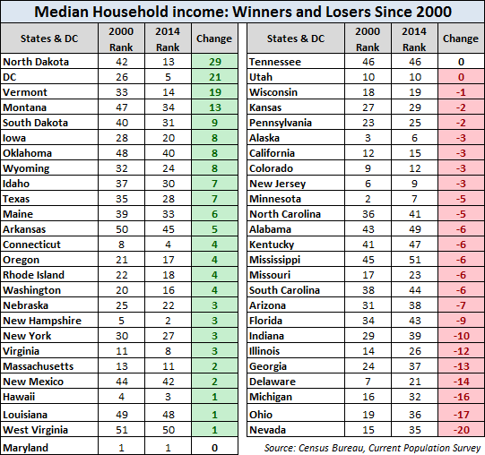
The many economic and political factors underlying the changes in rank are beyond my scope. I will point out, however, that the “Unchanged” category was the obvious goal for residents of Maryland, the top state for median income in 2000, but probably not for 50th place Arkansas.
In a follow-up commentary, I’ll take another look at median incomes by state after adjusting for the cost of living. As you can readily anticipate, the rankings shift dramatically.
Notes:  Click on the adjacent image to visit a page with links across the top that will facilitate comparison of the tables and maps in this commentary.
The tables and maps above are based on state median income data from the American Community Survey and annual supplements available (here).
The inflation-adjustment used for the CPS data is based on a little-known version of the Consumer Price Index, the CPI-U-RS (RS stands for “research series”). For more about this deflator, see my annual update comparing hypothetical deflators as applied to US median household incomes.


