

Courtesy of Doug Short’s Advisor Perspectives.
Note: With the release of this morning’s Consumer Price Index, we’ve updated this commentary to include the Real Retail Sales data for July.
Official recession calls are the responsibility of the NBER Business Cycle Dating Committee, which is understandably vague about the specific indicators on which they base their decisions. This committee statement is about as close as they get to identifying their method.
There is, however, a general belief that there are four big indicators that the committee weighs heavily in their cycle identification process. They are:
- Nonfarm Employment
- Industrial Production
- Real Retail Sales
- Real Personal Income (excluding Transfer Receipts)
The Latest Indicator Data
Month-over-month nominal sales were flat in July (-0.04% to two decimals). Real Retail Sales, calculated with the seasonally adjusted Consumer Price Index, were also flat (0.003% to three decimals), an overall decline from the June real MoM 0.61% increase. The chart gives us a close look at the monthly data points in this series since the end of the last recession in mid-2009. The linear regression helps us identify variance from the trend.

The early 2014 dip in sales was generally written off as a temporary result severe winter, and the return to trend sales growth gave credence to the explanation. The early 2015 dip triggered the same explanation, but following the subsequent recovery, Real Sales have difted upward, but below trend.
The Generic Big Four
The chart and table below illustrate the performance of the generic Big Four with an overlay of a simple average of the four since the end of the Great Recession. The data points show the cumulative percent change from a zero starting point for June 2009.
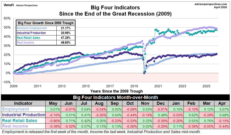
Current Assessment and Outlook
The US economy has been slow in recovering from the Great Recession, and the overall picture has been a mixed bag for well over a year and counting. Employment and Income have been relatively strong. Real Retail Sales have been weak at best over the past twelve months, and Industrial Production has essentially been in a recession, although optimists are hoping that the March low was a trough and IP may now be in recovery mode.
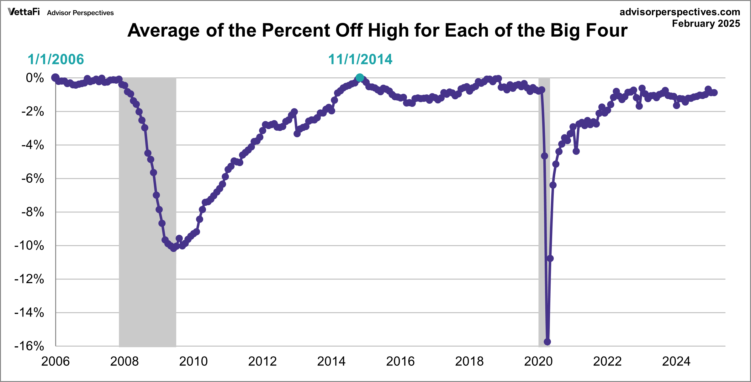
Here is a percent-off-high chart based on an average of the Big Four. The interim high was in November 2014 (fractionally below zero at three decimal places). The indicator primarily responsible for this decline is Industrial Production. Incidentally, the last time the average of the four set an all-time high was in January 2006.
The next updates of the Big Four will be the Mid-August releases of the July numbers for Industrial Production and Real Retail Sales.
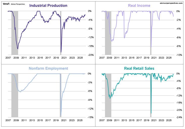
Background Analysis: The Big Four Indicators and Recessions
The charts above don’t show us the individual behavior of the Big Four leading up to the 2007 recession. To achieve that goal, we’ve plotted the same data using a “percent off high” technique. In other words, we show successive new highs as zero and the cumulative percent declines of months that aren’t new highs. The advantage of this approach is that it helps us visualize declines more clearly and to compare the depth of declines for each indicator and across time (e.g., the short 2001 recession versus the Great Recession). Here is our four-pack showing the indicators with this technique.
Now let’s examine the behavior of these indicators across time. The first chart below graphs the period from 2000 to the present, thereby showing us the behavior of the four indicators before and after the two most recent recessions. Rather than having four separate charts, we’ve created an overlay to help us evaluate the relative behavior of the indicators at the cycle peaks and troughs. (See the note below on recession boundaries).
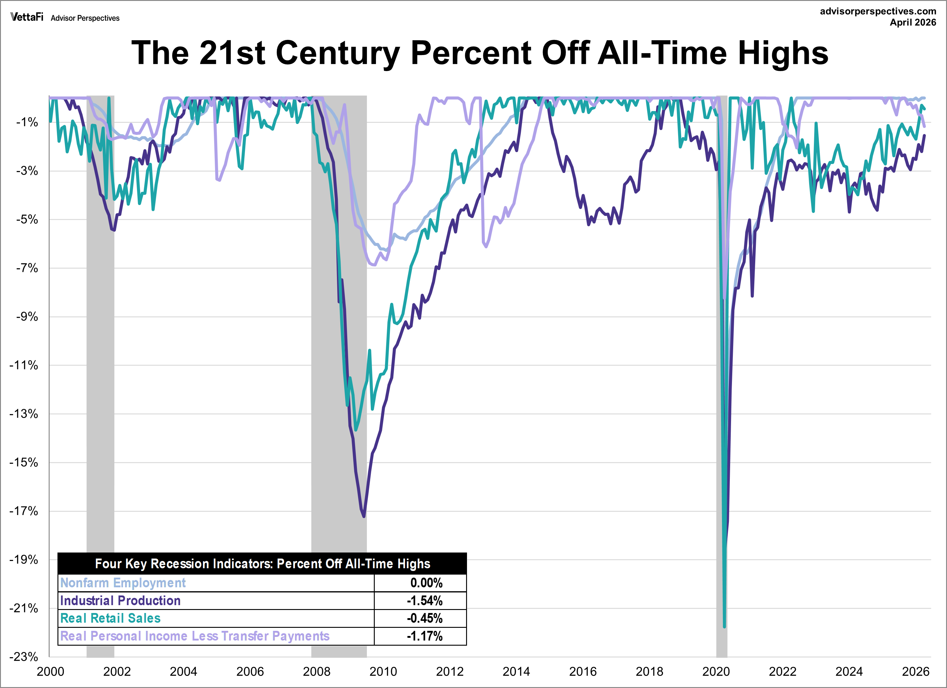
The chart above is an excellent starting point for evaluating the relevance of the four indicators in the context of two very different recessions. In both cases, the bounce in Industrial Production matches the NBER trough while Employment and Personal Incomes lagged in their respective reversals.
As for the start of these two 21st century recessions, the indicator declines are less uniform in their behavior. We can see, however, that Employment and Personal Income were laggards in the declines.
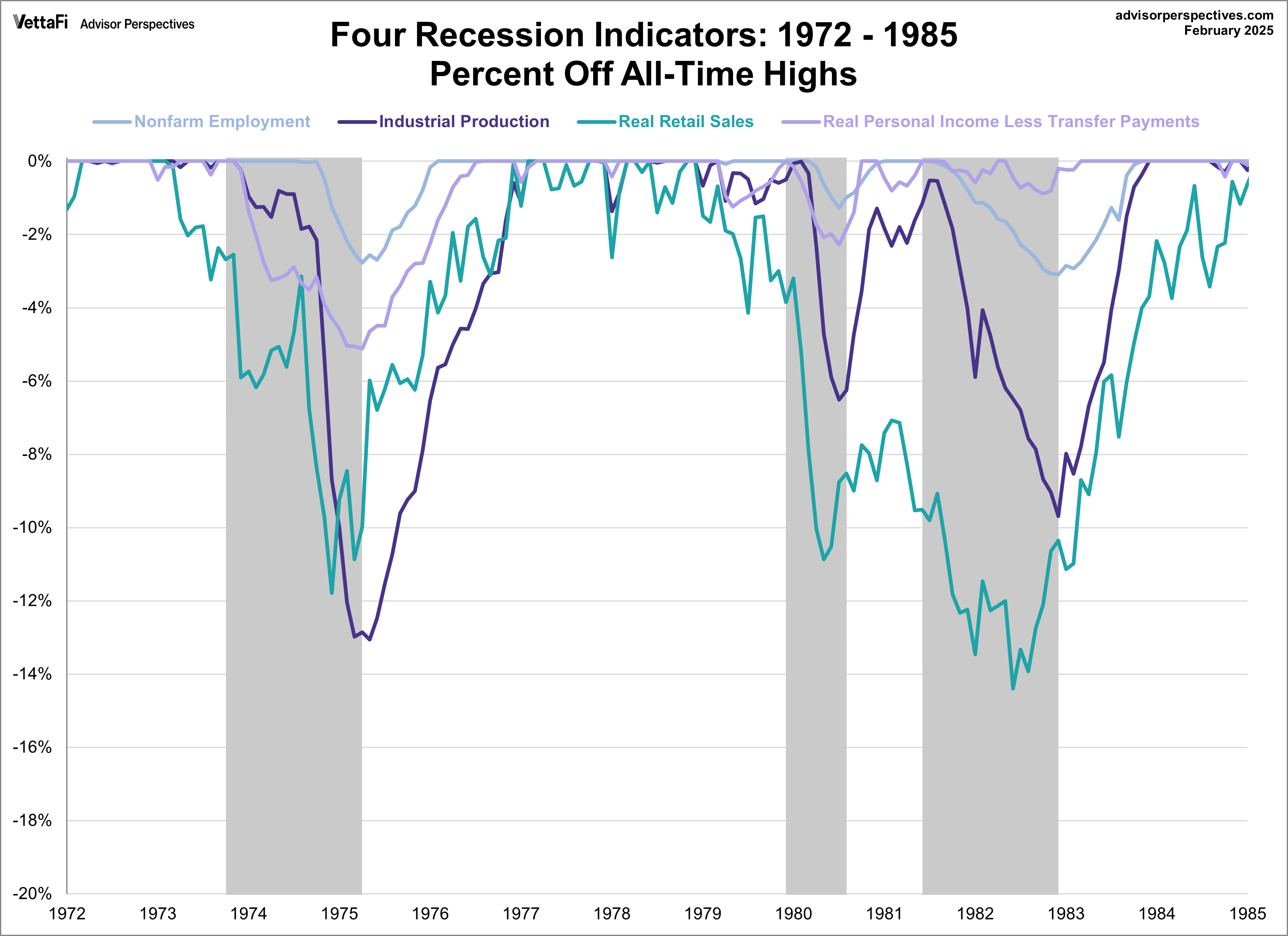
Now let’s look at the 1972-1985 period, which included three recessions — the savage 16-month Oil Embargo recession of 1973-1975 and the double dip of 1980 and 1981-1982 (6-months and 16-months, respectively).
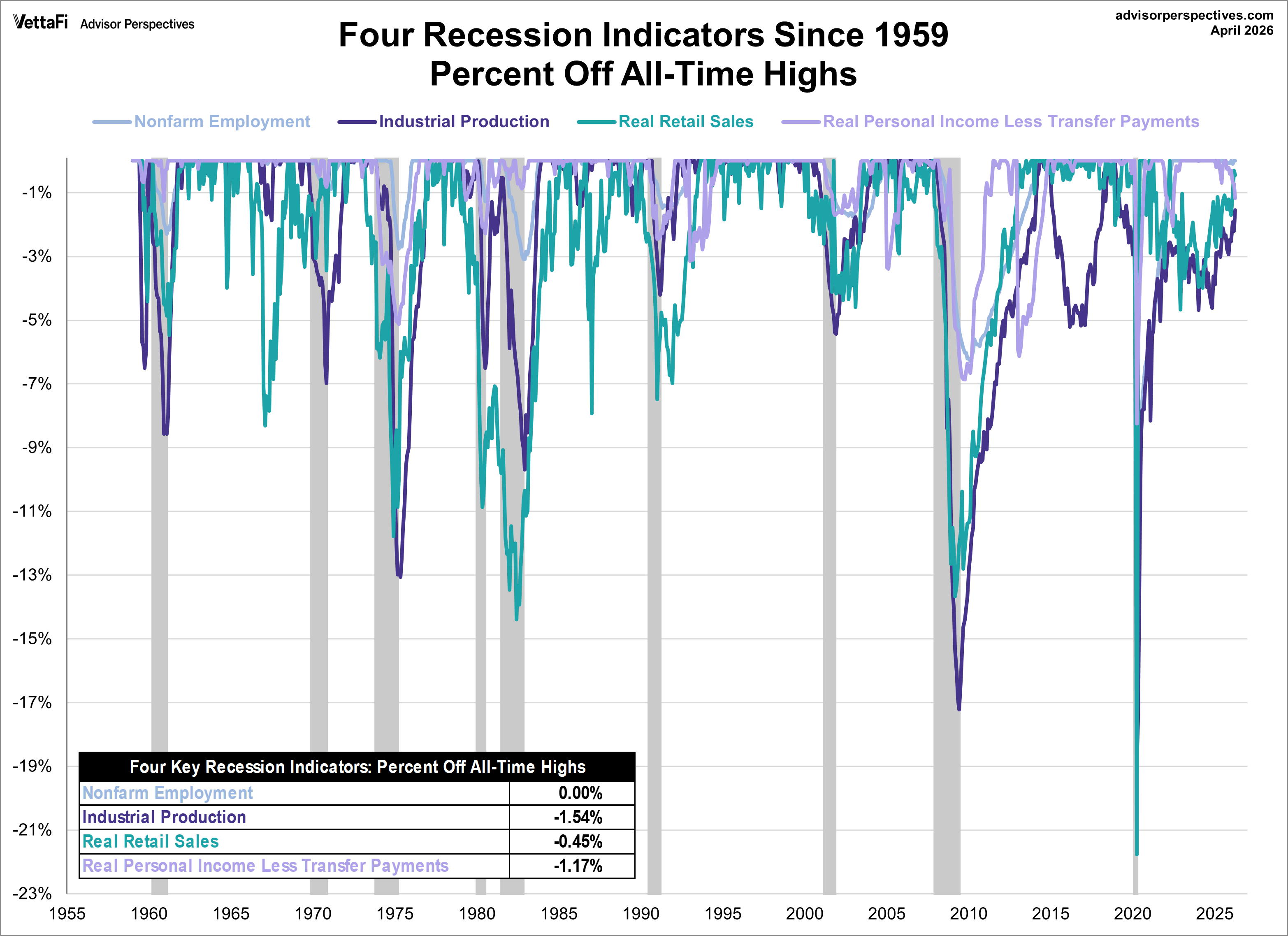
And finally, for sharp-eyed readers who can don’t mind squinting at a lot of data, here’s a cluttered chart from 1959 to the present. That is the earliest date for which all four indicators are available. The main lesson of this chart is the diverse patterns and volatility across time for these indicators. For example, retail sales and industrial production are far more volatile than employment and income.
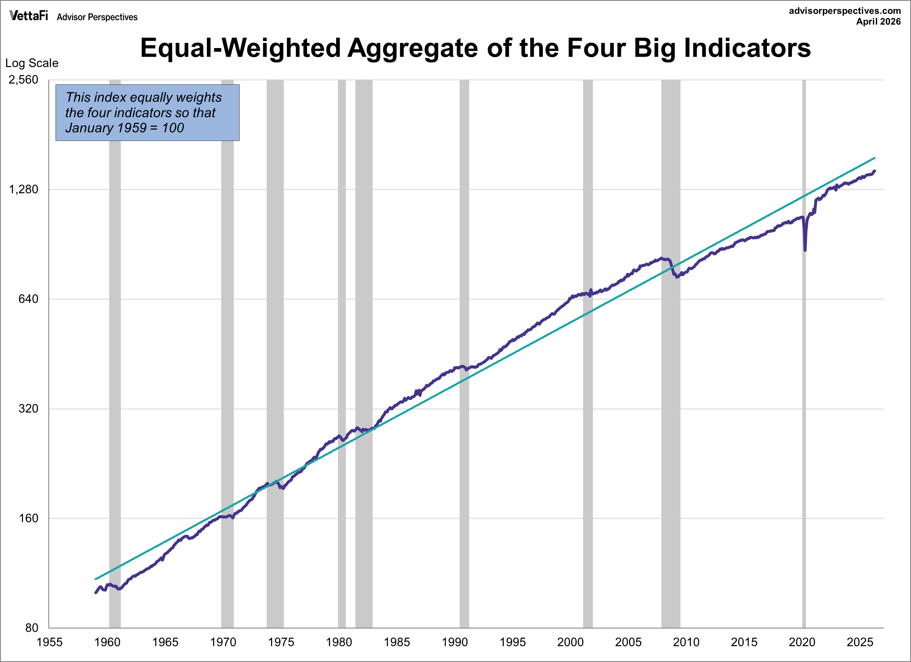
The charts above focus on the Big Four individually, either separately or overlaid. Now let’s take a quick look at an aggregate of the four. The next chart is an index created by equally weighting the four and indexing them to 100 for the January 1959 start date. We’ve used a log scale to give an accurate indication of growth and also added an exponential regression to assist us in seeing the secular patterns of faster and slower growth. As we can readily see, growth of this aggregate indicator has slowed dramatically since the end of the last recession.
Now let’s plot the percent off high for this aggregate index. As we immediately recognize, it is completely worthless as leading indicator of recessions. The aggregate index set a new high the month before the recession began for five of the eight recessions since the early 1960s.
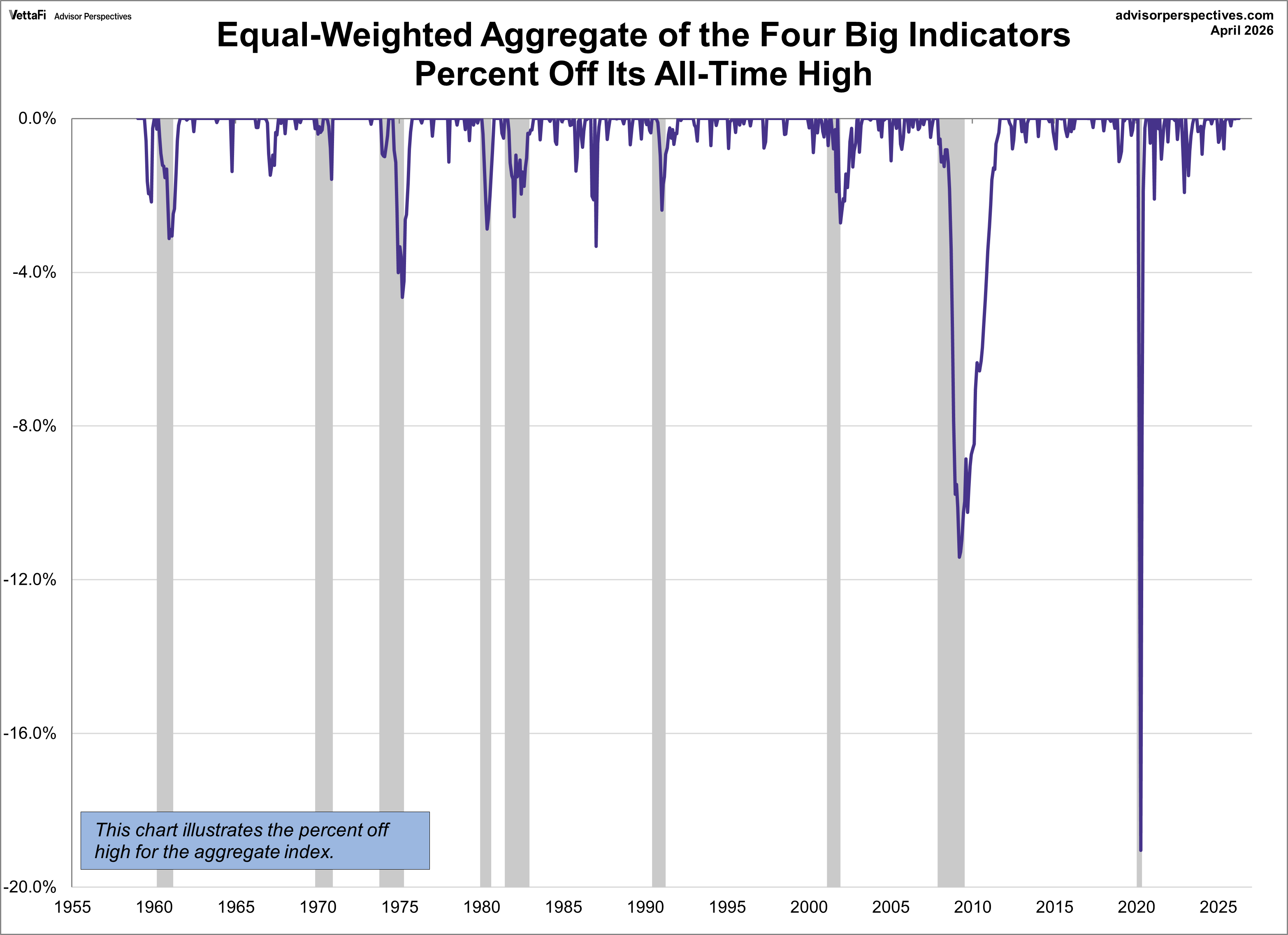
We can construct a better leading indicator by plotting the average of the percent off highs for each of the four, which is the technique we’ve used in the next chart. Here we’ve highlighted the months when all four indicators were at all-time highs. The dashed line shows the -0.93% average of the four at recession starts.
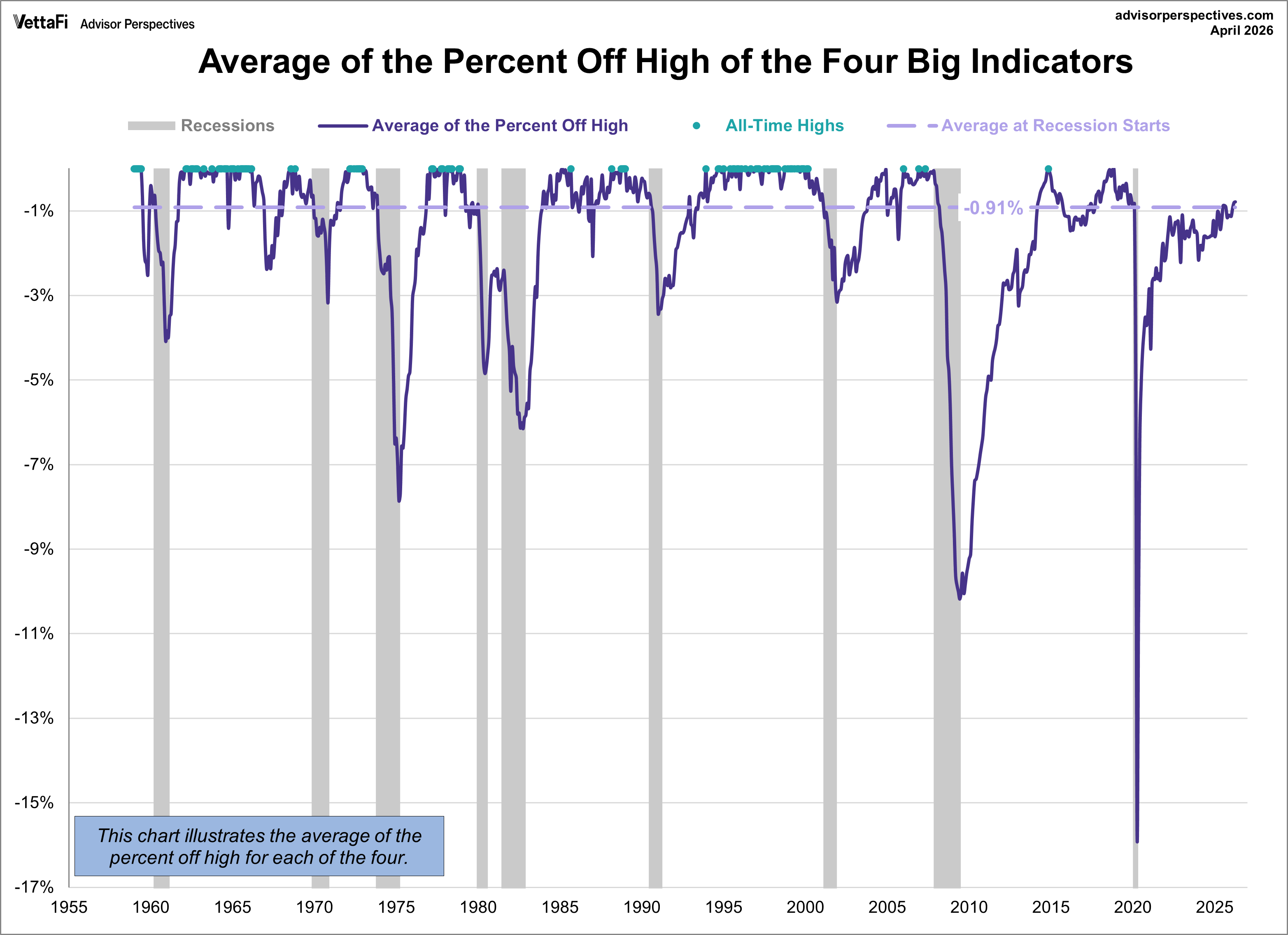
The chart clearly illustrates the savagery of the last recession. It was much deeper than the closest contender in this timeframe, the 1973-1975 Oil Embargo recession.
Appendix: Chart Gallery with Notes
The indicator discussed in this article is illustrated below in three different data manipulations:
- A log scale plotting of the complete data series to ensure that distances on the vertical axis reflect true relative growth. This adjustment is particularly important for data series that have changed significantly over time.
- A year-over-year representation to help, among other things, identify broader trends over the years.
- A percent-off-high manipulation, which is particularly useful for better understanding of trend behavior and secular volatility.
Real Retail Sales
This indicator is a splicing of the discontinued retail sales series (RETAIL, discontinued in April 2001) with the Retail and Food Services Sales (RSAFS) and deflated by the seasonally adjusted Consumer Price Index (CPIAUCSL). We’ve used a splice point of January 1995 because that date was mentioned in the FRED notes. Our experiments with other splice techniques (e.g., 1992, 2001 or using an average of the overlapping years) didn’t make a meaningful difference in the behavior of the indicator in proximity to recessions. We’ve chained the data to the latest CPI.


A Note on Recessions: Recessions are represented as the peak month through the month preceding the trough to highlight the recessions in the charts above. For example, the NBER dates the last cycle peak as December 2007, the trough as June 2009 and the duration as 18 months. The “Peak through the Period preceding the Trough” series is the one FRED uses in its monthly charts, as explained in the FRED FAQs illustrated in this Industrial Production chart.


