

By Jacob Wolinsky. Originally published at ValueWalk.
Whitney Tilson’s email to investors discussing the best chart EVER on how the coronavirus developed in China and the implications for us; What happens after big first-quarter declines?; Luckin Coffee collapses.
Q4 2019 hedge fund letters, conferences and more
How The Coronavirus Developed In China
1) STOP THE PRESSES!
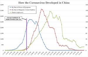
The chart below, which shows how the coronavirus developed in China, may be the best, most important one I’ve ever shared…
As you know, the virus follows a fairly predictable pattern that can last for more than a month. First, a certain number of people get infected. Then, over many days, some of them begin to show symptoms. Then, subsequent days later, some need to be hospitalized. Finally, often weeks later, patients either recover (albeit some with long-term issues like lung damage) or die. There’s a lag effect – like a pig in a python. It’s critical to understand this… but most people don’t.
In this chart, for each person who tested positive, there are three dates: When they said they first started feeling sick (the blue line shows the total number of such people in China each day), when they tested positive (red line), and when a small fraction of them died (green line). Each data point is a three-day average. Take a look…

Source: JAMA (symptoms) (original source here); Worldometers (tests and deaths).
For each metric, you can see a surge and then rapid decline, but at different times.
The number of new people showing symptoms peaked on January 26, but the peak in the number of new cases per day wasn’t until 11 days later on February 6.
This reflects two things: first, most people don’t rush to get tested the day they first start having symptoms like a mild sore throat, cough, and fever. Most probably figure it’s just a regular cold, so they don’t seek treatment – much less get tested – until they’re really feeling lousy a week or two later. Then, compounding the delay, there were testing delays in China, just like we’re seeing here.
And the peak in deaths wasn’t for another eight days on February 14.
Look at what happened in how coronavirus developed in China (mostly the city of Wuhan): the number of infected people rose rapidly, about 10 times, from 190 to 2,008 (trailing three-day average) – in only nine days from January 14 to January 23. That’s when the Chinese government did an about-face and implemented an extreme lockdown of the entire province, shown by the purple vertical line in the chart above.
And it worked – almost immediately! As you can see, the number of newly infected people only rose slightly the next three days, peaking at 2,717, and then, in less than three weeks, steadily dropped to almost zero!
But here’s the key: nobody could see this.
Instead, people could only see the number of reported new cases – the red line. Looking at the data, one would no doubt be convinced (wrongly!) that the lockdown wasn’t working because reported new cases were skyrocketing.
To repeat: whereas the actual number of new cases peaked almost immediately after the lockdown, the peak in the reported number of new cases didn’t occur for another 14 days!
In summary, as soon as China locked down Hubei province, the growth of actual new cases plateaued and started to fall within days, dropping to almost zero within three weeks. Yet reported new cases soared for another two weeks as testing caught up with what was really happening.
And deaths – which is what really generates headlines and panic – didn’t peak until eight days after that.
I’m cautiously optimistic that the same phenomenon is playing out right now in the U.S.
I can’t prove it, though. It’s an educated guess, nothing more.
The reality is, until there is more widespread testing and we get another week or two of data, we’re all flying blind. Nobody knows how many people are actually infected here in the U.S. right now, where they are, and how rapidly that number is growing.
Because we can’t answer these questions, those who are making the most extreme predictions are getting the most attention – and nobody can prove them wrong.
But what I do know is, because of the lag effect, even if the measures we’ve taken in the past couple weeks are working well (as I believe they are), bringing the virus’s replication rate well below 1.0, we won’t know it.
As a result, the number of new cases, hospitalizations, and deaths will almost certainly continue to go up for at least a couple of weeks, almost certainly leading to universally bad headlines in the U.S. and Europe during this period.
So, fasten your seat – belt – based on how coronavirus developed – it’s going to be a wild ride going forward.
But don’t panic and don’t lose hope!
What Happens After Big First-Quarter Declines?
2) Here’s some more evidence that it’s time to buy, even with the terrible headlines and uncertainty (if you want to wait for a clear outlook, stocks will be 30% higher!)… Ryan Detrick at LPL Financial looked at the returns for the S&P 500 Index after big declines in the first quarter:

Luckin Coffee Collapses
3) China’s Luckin Coffee (LK) collapsed by 76% yesterday to $6.40 after the company admitted that it’s investigating “fabricated sales” that could total more than $300 million, and said its prior guidance and sales figures from the second quarter of 2019 to the fourth quarter of 2019 are no longer reliable.
I trust none of my readers got caught in this debacle – and maybe some even profited on the short side – because in my February 11 e-mail, with the stock at $38.15, I warned my readers about it. As I said:
Speaking of stocks to avoid, investors have fallen hard for the growth story surrounding China’s Luckin Coffee (LK)… awarding the company a $9.3 billion market cap, which is equal to a nosebleed 19.5 times trailing revenues. I saw Luckin’s presentation at the ICR Conference last month and have to admit that I was impressed.
But as with so many other Chinese companies (it remains the Wild West over there), Luckin may not be all that it claims to be, as MarketWatch highlights: Luckin Coffee stock sinks after anonymous report alleges fraud.
For more color on this, I e-mailed my friend, famed short-seller Carson Block of Muddy Waters Research, who released the report on behalf of the author (who wishes to remain anonymous for good reason: China has been known to harass and even imprison those who publish negative articles about companies, no matter how accurate the information).
Carson e-mailed me the full 89-page report and said I could share it, so I’ve posted it here. He added:
I know who wrote it, so when I Tweeted it, I wrote “unattributed” as opposed to “anonymous.” He’s a serious, smart money guy.
Here’s the Executive Summary:
When Luckin Coffee (Nasdaq: LK) (“Luckin” or the “Company”) went public in May 2019, it was a fundamentally broken business that was attempting to instill the culture of drinking coffee into Chinese consumers through cut-throat discounts and free giveaway coffee. Right after its $645 million IPO, the Company had evolved into a fraud by fabricating financial and operating numbers starting in third quarter 2019. It delivered a set of results that showcased a dramatic business inflection point and sent its stock price up over 160% in a little over two months. Not surprisingly, it wasted no time to successfully raise another $1.1 billion (including secondary placement) in January 2020. Luckin knows exactly what investors are looking for, how to position itself as a growth stock with a fantastic story, and what key metrics to manipulate to maximize investor confidence. This report consists of two parts: the fraud and the fundamentally broken business, where we separately demonstrate how Luckin faked its numbers and why its business model is inherently flawed.
I haven’t done any research on Luckin, but after reading the report, I think it’s very well done.
Luckin stockholders, beware!
The post The Most Important Chart For Understanding Coronavirus appeared first on ValueWalk.
Sign up for ValueWalk’s free newsletter here.


