

Courtesy of Dana Lyons
The post-2009 UP trendline in the broad Value Line Geometric Composite was violated today.
 Most technicians and chartists have what they consider their important levels on a chart. Whether it is a prior low or high, a moving average, a trendline, etc. These are levels that, if violated, mark a significant change in character for that particular price series – or at least it marks a significant change in its interpretation. While our firm is generally more interested in analyzing more comprehensive measures pertaining to the market’s structure rather than a single price point on one specific chart, there are a few undeniably important levels in our view. And perhaps the most important price point in the entire equity market was broken today.
When we consider what, to us, constitutes a significant chart level on a market-wide basis, it must be characterized by two things. First, it has to be an index or security of substantial influence. And second, the price level should preferably be of consequence on at least a cyclical (i.e., years) basis. Well, probably the single most beneficial force in the global financial markets for some time now has been the steady uptrend in the U.S. equity market. Other equity markets around the world have waxed and waned and other asset classes have varied between average (fixed income) and abominable (commodities). But U.S. stocks have been the rock – fortunately too as it is the largest stock market in the world.
And the most important barometer of the U.S. stock market, in our view, may not be the general consensus pick. In fact, many market participants likely have never even heard of it. The Value Line Geometric Composite (VLGC) is an index comprised of approximately 1700 stocks. It is also equally-weighted. Therefore, we feel it provides a better picture into the health of the broad U.S. stock market than a more mainstream pick like the S&P 500, for example. And despite the fact that there are no VLGC products actually trading anymore, it still adheres very well to most chart analyses.
That being the case, today’s break of the VLGC’s post-2009 UP trendline is one of those select price developments that we deem to be important to the macro market – and maybe the most important.
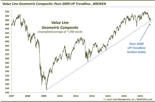
As you can see, although there is no trading based on the index, the VLGC still respects basic technical patterns, at least the one shown on the chart. The trendline drawn from the 2009 low connects almost precisely the 2011 and 2012 lows. Extending it further, you can see that today’s shallacking in the VLGC took the index clearly below the post-2009 UP trendline.
This, to us, is significant. That’s because it passes the 2 tests of an “important” price point that we laid out above. First, as the broadest equal-weight measure on the U.S. equity market, it is of great influence. Secondly, as it pertains to the most important trend in the financial world (from a positive standpoint) – the cyclical U.S. stock market rally – today’s development is of great significance both on a macro level and on a multi-year (cyclical) basis.
No, it does not mean that the stock market will drop straight down from here (the VLGC is actually nearing some key Fibonacci support lines). It doesn’t even mean that some of the averages cannot eventually make a new high in this cycle. However, it is significant in that it is the first price crack in the post-2009 uptrend. It is significant because the index is comprised of roughly 1700 stocks, as opposed to a top-heavy, potentially misleading index. And it is significant because the trendline that has been broken had held precisely (i.e., respected) on its previous touches the past 6 years.
Thus, this important development changes our interpretation of the chart, and potentially the market in general. The odds of the post-2009 bull market continuing unimpeded are now significantly reduced. The odds are much greater that the VLGC (market?) will enter some combination of a protracted decline or sideways pattern.
We don’t get happy feet about too many lines on a chart – only the important ones. And this one is about as important as they come.
* * *
More from Dana Lyons, JLFMI and My401kPro.
Picture courtesy of Geralt at Pixabay.