

Risk Ratio Charts Breaking Out (relatively speaking)
Courtesy of Joshua Brown, The Reformed Broker
I won’t go so far as to say that these are the only charts that matter, but I think right now – at this moment – they could be.
Below, I’m doing a few ratio charts to demonstrate that the sectors in the eye of this year’s storm – emerging markets, materials, oil stocks and industrial metals – are all staging dramatic comeback rallies relative to the S&P 500. To me, this is a more important story than anything happening with bonds or biotechs. These are the very sectors / asset classes that have brought global risk appetite to its knees this year. If they’re truly putting in a bottom, sentiment about global growth could materially improve (pun intended), providing support for risk assets in general.
Just this morning, Morgan Stanley put out a big call saying it’s time to buy the metals and mining stocks. It’s definitely an outlier, as 2015 numbers repeatedly get ratcheted down for the group.
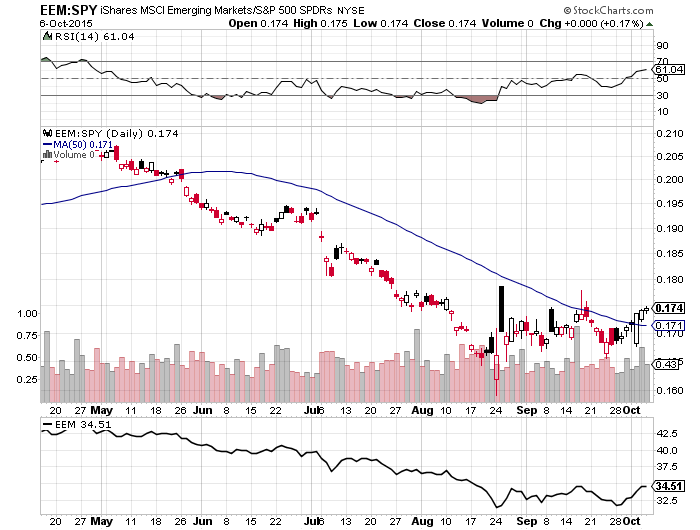
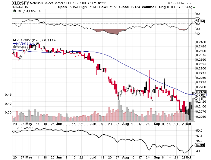
The good news is that these ratio charts are all breaking out to the upside, relative to the US stock market overall. Haven’t seen this in quite awhile. I’ve included 50-day moving averages for perspective. The top pane for each chart is relative strength, the bottom pane is pure price.
Let’s begin…
First, here’s the Emerging Market ETF (EEM) vs the SPY, now above the 50-day:
Here’s the materials SPDR ETF (XLB), with a nice confirmation by momentum (RSI charging toward 70):
Here is the energy sector SPDR vs the SPY, also on fire with an 11% jump in a week’s time:
Finally, a risk ratio that has not yet popped but may be hammering out a tradeable bottom – the Shanghai Composite vs the SPY. It stopped going down at the end of August. But can it get up? Because that would be the mother of all sentiment squeezes. Literally no one thinks it can. Maybe the consensus is right – but what if it’s not? Is anyone positioned for that?
Bottoms are nearly impossible to call in real-time, so this is probably, at best, a useful thought exercise for most investors. But if these charts are getting constructive, it would represent a huge weight lifting off of everyone.