Courtesy of Lee Adler of the Wall Street Examiner
Claims data is consistent with the consensus for an increase of 100,000 in nonfarm payrolls tomorrow. But real time Federal Withholding tax data suggests that the data will beat the consensus estimate, and not just by a little. This is an excerpt update from the permanent employment charts page, which is updated when new data is available, and which you can bookmark for future reference.
Initial Claims Charts
Updated July 5, 2012
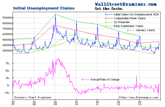
In the week ended June 30 actual claims (not seasonally finagled) were 371,000 (rounded) including the addition of 4,000 claims to adjust for incomplete state counts that do not include interstate claims at the time of the advance release (current week). The week was stronger than the week ended July 2, 2011 when new claims totaled 426,000.
Approximately 55,000 or 12.8% fewer people filed first time claims this year than in the same week in 2011. This was also better than the average of the last 10 years’ claims for this week of 383,000.
This week historically has typically had an increase in claims. This year, the week to week change versus the same week in 2011 was also better than last year. Claims increased by less than 1,000 in the current week versus 19,000 for this week in 2011 and a 10 year average increase for the same week of 13,000.
There’s a lot of week to week volatility in the data. Looking at a two week span, claims increased by 7,000 versus an increase of 31,000 in the same 2 weeks in 2011. The 10 year average for this 2 week period was an increase of 19,000.
Overall, this week’s data shows that the trend is still improving, and that the rate of improvement may be increasing. On the chart, the slope of the year to year line for this week is running about the same as the slower 52 week moving average. The annual rate of decrease in new claims continues to oscillate around the -10% axis. The latest data was down by 12.8%. Only if that difference shrinks to less than 3% that could be the first clear warning of a potential decline in employment ahead. Anything between a decline of 3% and 20% year to year suggests that the improving trend is on track. On the basis of this data at least, the Fed has no reason to announce additional QE at the next week FOMC meeting ( more in depth analysis in the Professional Edition Fed Report).
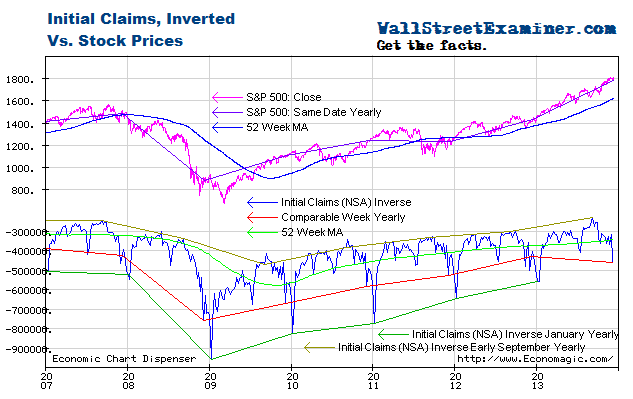
Plotted on an inverse scale, the correlation of the trend of claims with the trend of stock prices is strong. Both are driven by the Fed’s operations with Primary Dealers as covered weekly in the Professional Edition Fed Report. See also The Conomy Game, a free report. This chart suggests that the as long as this trend in claims is intact, the S&P would be overbought at approximately 1450, and oversold at roughly 1200. The Professional Edition Daily Market Updatescover my take on the technical side of the market for those who follow the charts in that regard.
As the number of workers eligible for unemployment compensation has trended up since 2009, the percentage of workers filing first time claims has continued to decline. Comparing the current week yearly line to the 52 week moving average the trend of improvement has slowed slightly, but this could change with the June payrolls data, which should show a significant increase in the number of employed workers.
In the reference week for the payrolls data, which includes the 12th of the month, total continuing claims dropped by 268,000 versus the same week in May. That cannot be translated directly to job gains because an unknown portion of the decline is due to exhaustion of benefits. At the same time, other people are newly entering the workforce.
Looking at past months and years as a guide, the NSA nonfarm payrolls change for June may be approximately 1.6 times the drop in continuing claims. That would indicate a total increase of 429,000 to a NSA total of 134.1 million. The seasonal finagle factor for last June was .9922. That suggests a seasonally adjusted payrolls number of 133.1 million a gain of around 100,000 from last month. The consensus estimates are for a gain of 100,000.
The chart below gives a longer term perspective on claims. We can see the trend improving but still above the bubble years with their 10 million fake jobs taking orders for new and unneeded condos and houses, building them, and taking and processing mortgage applications. This however does not account for the thousands of mortgage industry executives and Wall Street bankers who should be in jail but who still have jobs, and still bribe politicians.
The following chart is a picture of reality versus the the Impressionist art of seasonal adjustments. Sometimes the SA data represents reality to some degree, and sometimes it doesn’t. If you are following that data, at any given time you have no way of knowing which it is. One thing is certain–photo-realism it ain’t. There are ways to measure trends using actual data. One way is shown on this chart, which is to show the year to year line as of the current and corresponding date. Another is to view the annual rate of change as shown in the first chart above. In the most recent weekly data, the SA data suggests that the data is weakening, with the SA claims trend rising since February. The arbitrary seasonal adjustment process has raised a couple of false alarms over the past 2 years with big counter trend pops early in the second half of 2010 and in the second quarter last year. This looks like another one.
Enter your thoughts in the Comment Form at bottom of page. No registration necessary.
Federal Withholding Taxes
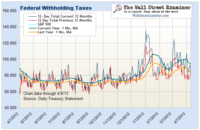
Updated July 5, 2012 This chart compares current withholding tax collections with last year on the same date. This year has been running ahead of last year in nominal terms. As of July 2, collections for the prior 10 business days were 7.6% greater than last year. A month ago, the edge was 7.5%. The rate of gain has been steady. In the week that included the week to which the BLS jobs data applies, which is the week including the 12th of the month, the month to month change in 10 day collections was +0.8%. The relationship between this data and the nonfarm payrolls data is haphazard and not a reliable predictor of payrolls. That being said, a 0.8% gain would result in a gain much larger gain than the consensus estimate of 100,000. So the number could be a big “beat.”
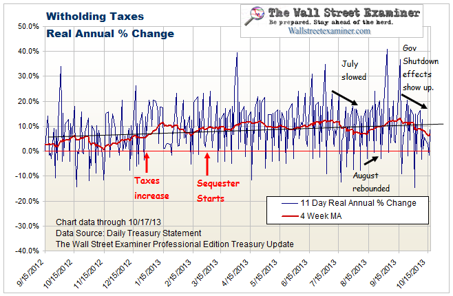
In real terms, the year to year gain in withholding taxes has been averaging around 3.5% over the past few weeks based on virtually a zero year to year increase in average wages reported in May. That number should change in the jobs data for June. The inflation of average wages had been running in the 2-3% range prior to May. May’s number was an outlier. We can’t reasonably apply the year to year percentage gain in withholding to derive a payrolls estimate.
These 2 charts are updated and analyzed weekly in the Professional Edition Treasury update in conjunction with their implications for employment, and in particular the Federal deficit and Treasury supply.
Get regular updates the machinations of the Fed, Treasury, Primary Dealers and foreign central banks in the US market, in the Fed Report in the Professional Edition, Money Liquidity, and Real Estate Package. Click this link to try WSE's Professional Edition risk free for 30 days!
Copyright © 2012 The Wall Street Examiner. All Rights Reserved. The above may be reposted with attribution and a prominent link to the Wall Street Examiner.


