

Courtesy of Mish.
The latest jobs report showing a Gain of 163,000 on the Establishment Survey, But a Loss of 195,000 Jobs on the Household Survey got me to thinking about trends in employment.
Much depends on your frame of reference. I can easily make numbers look good or bad, depending on how I want to present them.
click on any chart for sharper image
Civilian Employment Since 2011
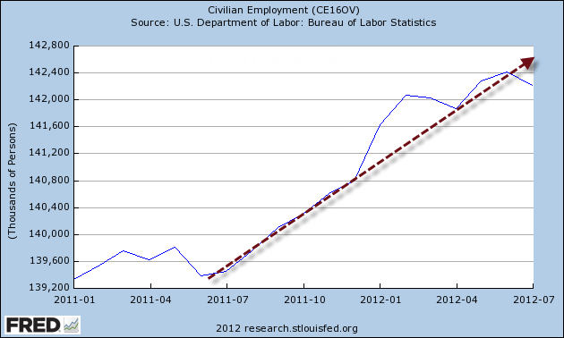
That certainly looks quite robust, but is that the real sustainable trend?
Here is another view.
Civilian Employment Since 2007
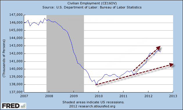
Which trendline is correct?
Civilian Employment Since 2007 – Different Perspective
…