

Courtesy of Mish.
In response to 55% of Americans Say Their Income Taxes are Fair; 46.6% Paid No Income Tax in 2011 one seriously misguided soul responded “your hate for low income people disturbing”.
The above response was humorous because the math shows a large number of people are unhappy even though thy pay no income taxes at all. Nowhere did I state or imply any hatred of anyone.
On a far more credible note, I received an email from Ironman at the Political Calculations blog who posted this chart on “Who Really Isn’t Paying Their Fair Share of Income Taxes?“
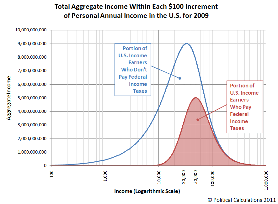
click on chart for sharper image
I asked Ironman to explain the chart. Here is his reply.
We used U.S. Census data to model the total aggregate income earned by individual Americans for each $100 increment of income in 2009 to create the “blue” income distribution bell curve using regression analysis, which we originally did as part of another project, where we modeled the total money income distribution of Americans.
We then took the Tax Policy Center’s data for the percentage of tax units without income tax liability for given levels of income and modeled that as well – and in doing that, we also get the percentage of tax units that do have income tax liability over the same income range.
We then multiplied the percentage of tax units with income tax liability by the total amount of aggregate income earned within a given amount of income to determine the portion of that aggregate U.S. income that is subject to income taxes. That result is represented as the “red”-shaded bell curve on the chart.
The unshaded region under the “blue” total aggregate income curve is then the portion of income earned by Americans that is not subject to income taxes.
What If?
In a followup email, I asked Ironman what the result would have been, if a 100% tax on all income above $1 million been in place. To that question he replied …
…