Courtesy of Lee Adler of the Wall Street Examiner
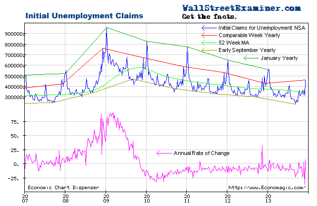
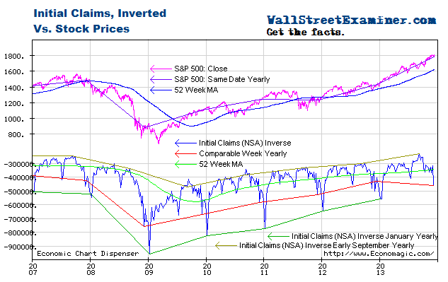
The latest weekly jobless claims data remained on trend, declining at an annual rate of 9.9%. Stock prices remain extended relative to the improvement in claims. That extension would become more extreme if stocks are entering a parabolic blowoff phase. That would play into the hands of FOMC hawks who want to cut back the rate of Fed purchases under QE.
The Labor Department reported that the seasonally adjusted (SA) representation of first time claims for unemployment fell by 24,000 from a revised 358,000 (was 360,000) in the advance report for the week ended July 13, 2013. The consensus estimate of economists of 348,000 for the SA headline number was too pessimistic (see footnote 1) in the game of pin the tail on the asinine.
The headline seasonally adjusted data is the only data the media reports but the Department of Labor (DOL) also reports the actual data, not seasonally adjusted (NSA). The DOL said in the current press release, “The advance number of actual initial claims under state programs, unadjusted, totaled 408,710 in the week ending July 13, an increase of 25,350 from the previous week. There were 455,260 initial claims in the comparable week in 2012.” [Added emphasis mine] See footnote 2.
The advance report is usually revised up by from 1,000 to 4,000 in the following week, when all interstate claims have been counted. Last week’s number was approximately 1,500 shy of the final number for that week released Wednesday. For purposes of this analysis, I adjusted this week’s reported number up by 1,500. The adjusted number that I used in the data calculations and charts for this week is 410,000 rounded. It won’t matter that it’s a thousand or two either way in the final count next week. The differences are essentially rounding errors, invisible on the chart.
The actual filings last week represented a decrease of 9.9% versus the corresponding week last year. The prior week was down 13.3%. The average weekly year to year improvement of the past 2 years is -8.4%. The range is from near zero to -20%. The year to year comparisons are now much tougher than the 2010-2012 period as the number of job losses declined sharply between 2009 and 2012. The fact that the rate of decline in recent weeks has been better than the 2 year average is a sign of a steady rate of increase in economic activity. This data does not support the reductions of already weak economic growth forecasts that have been prevalent in the past two weeks.
The current weekly change in the NSA number is an increase of 27,000 from the previous week. That compares with an average change of an increase of 12,000 for the comparable week over the prior 10 years. Last year’s comparable week had an increase 13,000. The current weekly performance is weaker than the comparable week last year, and weaker than the average of the previous 10 years, but it merely reverses a stronger comparison last week.
Looking at the big picture, this week’s data is in line with the trend of the past 2 1/2 years. Neither stopping or starting rounds of QE seems to have had an impact. Nor did the fecal cliff secastration. The US economy is so big that it develops a momentum of its own that policy tweaks do not impact. Policy makers and traders like to think that policy matters to the economy. The evidence suggests otherwise. That’s not to say that monetary policy does not matter to financial market performance. In some respects it’s all that matters. We must separate economic performance from market performance. The economy does not drive markets. Liquidity drives markets, and central banks control the flow of liquidity most of the time.
Some economic series correlate with stock prices well. Others don’t. This is one that has, and therefore it’s of some use in making a judgment about the health of the equities market. The correlation is most visible when the claims trend is plotted on an inverse scale with stock prices on a normal scale. I give little weight to economic indicators when analyzing the trend of stock prices, but economic indicators can tell us something about market context, which can be useful in formulating strategy and tactics. In this case, the data suggests that bubble dynamics are at work in the equities market.
Stock prices were running with the initial claims trend until the Fed started QE3 and 4 late last year, causing the stock price rise to accelerate. The Fed’s QE3-4 money printing campaign has had far more success in elevating stock prices, which was one of Bernanke’s stated goals, than in driving economic growth. The stock market appeared to be in parabolic blowoff mode by February as a result of the excess liquidity. It reached at least a temporary limit in May.
When the market reached the top of the trend in May, it was ripe for a correction. The market pulled back to support and then resumed its rise. Last week I wrote, “With Bernanke seemingly reaffirming that QE will be around for a while longer, there’s an increased likelihood that stock prices will decouple completely from economic indicators in the weeks ahead and continue in parabolic blowoff mode until the Fed takes concrete steps to reduce QE.” That still applies.
Continuing from last week, “Bernanke and his Fed cronies have sown tremendous confusion about when they will end QE, a reflection of their own confusion. I wrote in the Fed Report a couple of weeks ago that the Fed now faces a situation where it will have no choice but to cut back on QE in the months ahead. With some FOMC members increasingly worried about asset price bubbles, a stock market blowoff could be an added catalyst.”
Get regular updates the machinations of the Fed, Treasury, Primary Dealers and foreign central banks in the US market, in the Fed Report in the Professional Edition, Money Liquidity, and Real Estate Package. Click this link to try WSE's Professional Edition risk free for 30 days!
Copyright © 2012 The Wall Street Examiner. All Rights Reserved. The above may be reposted with attribution and a prominent link to the Wall Street Examiner.


