Courtesy of Lee Adler of the Wall Street Examiner
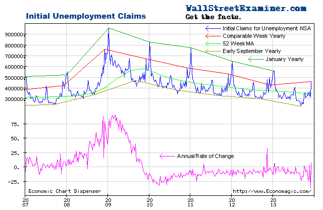
First time unemployment claims hit a record low as a percentage of total employed for the past 16 years, which is as far back as I have this stat. Claims totaled just 0.169% of total nonfarm payrolls, breaking the 2006 low of 0.186%. This is less than the levels seen during the housing bubble. Are we in another bubble?
Probably not. Labor Department officials warned that the record low could be due to a glitch. Two states were upgrading their computer systems during the week and did not report all the claims they received. For now I’ll treat this as not material, but that could change next week. Even with large revisions, this change was so big that the revised numbers might still result in a record. If they were simply on the same trend as last week they would have been 0.19%, just off the 2006 low. We’ll just have to wait and see what they tell us next week.
The Labor Department reported that in the week ending August 31, the advance figure for seasonally adjusted initial claims was 292,000, a decrease of 31,000 from the previous week’s unrevised figure of 323,000 (was 323,000). The 4-week moving average was 321,250, a decrease of 7,500 from the previous week’s revised average of 328,750. The consensus estimate of economists of 327,000 for the SA headline number was way too high (see footnote 1), but their bigger than usual miss is probably due to the data glitch.
The headline seasonally adjusted data is the only data the media reports but the Department of Labor (DOL) also reports the actual data, not seasonally adjusted (NSA). The DOL said in the current press release, “The advance number of actual initial claims under state programs, unadjusted, totaled 228,399 in the week ending September 7, a decrease of 40,250 from the previous week. There were 299,729 initial claims in the comparable week in 2012.” [Added emphasis mine] See footnote 2.
The actual filings last week represented a decrease of 23.5% versus the corresponding week last year. That is the largest decline since the first quarter of 2011. If, for argument’s sake it was due to the glitch the Labor Department reported, and if the change from last year was at the prior week’s rate of decline, which was -13.2% year over year, then this week would have been down by 8,500, which is near the average number for this week each year.
There’s usually significant volatility in this number but the current number was clearly an outlier, well outside the usual range of the past two years of from zero to -20%. Over the prior 6 weeks the rate of decline was 10-13%. The average weekly year to year improvement of the past 2 years is -8%.
The advance weekly report on first time claims is usually revised up by from 1,000 to 4,000 in the following week when all interstate claims have been counted. In an extremely rare occurrence, last week’s advance number was approximately 200 greater than the final number for that week posted today. For purposes of this analysis, I adjusted this week’s reported number up by 1,000 to 270,000 after rounding. Normally it does not matter that it’s a thousand or two either way in the final count the following week. The differences are essentially rounding errors, invisible on the chart. Next week, the revision is likely to be much larger, probably an increase in the 20,000 range.
The current weekly change in the NSA initial claims number is a drop of 39,000 from the previous week after adjustment and rounding. That compares with a drop of 10,000 for the comparable week last year and an average change of -2,000 for the comparable week over the prior 10 years. This decline was the largest reported since 2001.
This number therefore either represents exceptional strength, or glitch. Glitch accounts for most of it, but the Federal withholding tax data was quite strong for that week, so I suspect that the claims number would have been pretty strong in any case.Real time federal withholding tax data (which I update weekly in the Treasury Report) had a strong uptick in August that continued into September, a sign that the economy actually is accelerating after a weak performance in July.
To signal a weakening economy, current weekly claims would need to be greater than the comparable week last year. That hasn’t happened yet. The trend has been one of steady improvement. Regardless of what the real final number for the latest week is, the fact that recent weeks have been down from last year as much as they have been is extraordinary given that these comparisons are now much tougher than in the early years of the 2009-13 rebound.
Cliff-Note: Neither stopping nor starting rounds of QE seems to have had an impact on claims. Nor did the fecal cliff secastration. The US economy is so big that it develops a momentum of its own that policy tweaks do not impact. Policy makers and traders like to think that policy matters to the economy. The evidence suggests otherwise.
Monetary policy measures may have little impact on the economy, but they do matter to financial market performance. In some respects they’re all that matters. We must separate economic performance from market performance. The economy does not drive markets. Liquidity drives markets, and central banks control the flow of liquidity most of the time. The issue is what drives central bankers.
Some economic series correlate with stock prices well. Others don’t. I give little weight to economic indicators when analyzing the trend of stock prices, but economic indicators can tell us something about market context, in particular, likely central banker behavior. The economic data helps us to guess whether the Fed will continue printing or not. The printing is what drives the madness. The economic data helps to predict the central banker Pavlovian Response which is, when the bell rings —> PRINT! Weaker economic data is the bell.
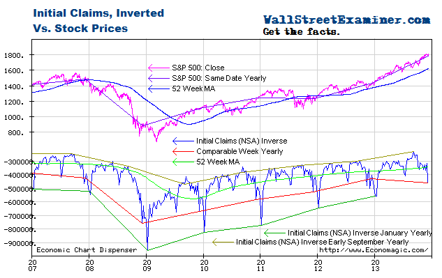
Stocks remain extended and vulnerable relative to the trends indicated by unemployment claims even after the recent pullback. QE has pushed stock prices higher but has done nothing to stimulate jobs growth. Excluding this week’s number, the rate of change in claims hasn’t changed since 2011 whether the QE spigot was turned on or turned off.
Given the recent strength in this data, the Fed can use it as an excuse for tapering QE at the upcoming FOMC meeting September 17-18.
I plot the claims trend on an inverse scale on the chart below with stock prices on a normal scale. The acceleration of stock prices in the first half of 2013 suggested that bubble dynamics were at work in the equities market, thanks to the Fed’s money printing. Those dynamics appeared to have ended in July but now there are signs that the market will make third drive toward the upper trendline. Tapering by the Fed would probably make the environment for stocks less friendly, but when bubbles enter their final runaway blowoff it usually takes more than a little tapping on the brakes to stop them. I address the specific potential outcomes in my proprietary technical work.
Get regular updates the machinations of the Fed, Treasury, Primary Dealers and foreign central banks in the US market, in the Fed Report in the Professional Edition, Money Liquidity, and Real Estate Package. Click this link to try WSE's Professional Edition risk free for 30 days!
Copyright © 2012 The Wall Street Examiner. All Rights Reserved. The above may be reposted with attribution and a prominent link to the Wall Street Examiner.


