

Courtesy of Mish.
I have an update from reader Tim Wallace on Social Security.
Hello Mish
I made new Social Security charts that show:
- Growth in percent from 1967 in average payout per month to those that receive social security
- Amount of money paid out to those that recieve social security per worker in the USA
- Average annual wages as presented in the Social Security systems “National Average Wage Index“
Senior citizens continue to receive all the benefits on the backs of the younger generations. By the way, I had to stop at 2011 as 2012 is not published yet.
Tim
Percentage Growth in Social Security Payments, Per Worker vs. Wage Growth

click on any chart for sharper image
Social Security Payments Per Worker
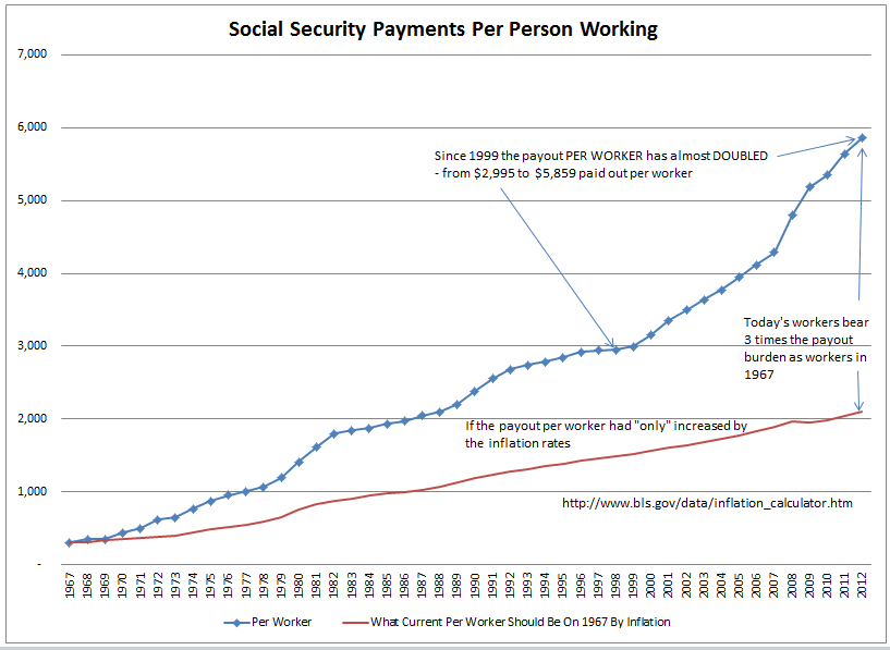
Demographics Says Path is Unsustainable
Clearly this payout trend is unsustainable, but what politician dare touch it?
…