

“The past is never dead. It’s not even past.”
Courtesy of Robert Waldmann of Angry Bear
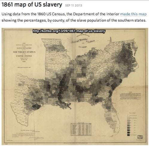
It’s always the same map.
Here from Brad Delong is the map of the percentage who were slave by county in 1861.
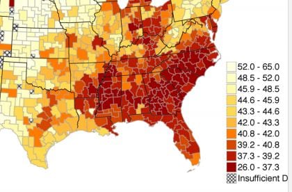
Here is the corresponding area of a map of intergenerational relative income mobility by county from R Chetty 2014 (warning pdf).
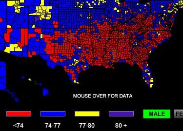
Here is a map of male life expectancy at birth.
It’s not past yet.
– Source.