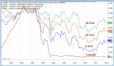
Courtesy of Mish.
Curve Watcher’s Anonymous has its eye on the yield curve again.
Over the course of the last year, and except for the close front-end, US treasury yields have risen across the board, and in some cases dramatically. This is what one would expect from a tapering Fed that is also discussing rate hikes.
However, the action is the last three months is not what one would expect.
click on any chart for sharper image
In the past year, 5-year treasuries have been hit the hardest (sharpest yield increase). That is not what one might expect from a strong recovery. And certainly a drop in the 30-year long bond is not what one would typically expect either.
Typically, when the Fed start hiking or announces intention to hike, the long end of the curve changes the most. It did, until the beginning of the year. The following charts will help put things in perspective.
Yield Curve as of 2014-03-28 Monthly
The above chart shows monthly “closes” where the yield was at the end of the month. The current month shows the present value.
Yield Curve as of 2014-03-28 Weekly
…


