

Courtesy of Mish.
Here is a second set of charts from reader Tim Wallace on labor force, population, and employment. The first set was a look at Labor Force, Employment, and Population April 2008 vs. April 2014.
This set compares the last two years, April 2012 vs. April 2104. Click on any chart to see a sharper image.
Age 16-24 Stats
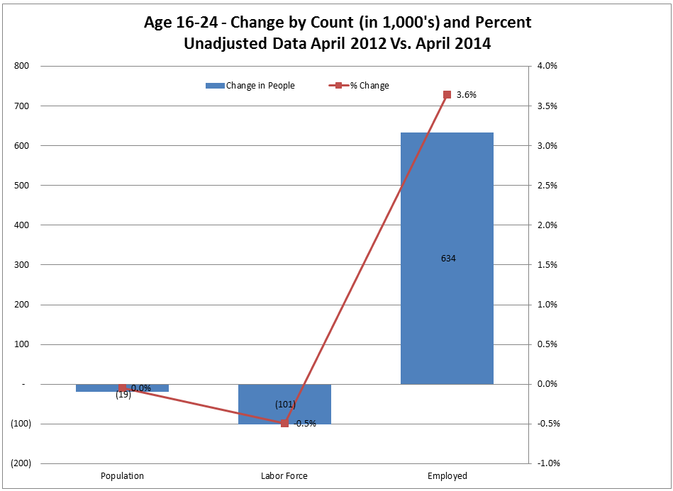
Since April 2012 the number of people in age group 16-24 dropped insignificantly as did the number of people in the labor force. The latter is down by 101,000. However, there has been a 3.6% upswing in employment of 634,000.
Age 25-54 Stats

Th age group 25-54 population is up slightly since 2012 but the labor force is down 0.5%. Employment is up 1.2% by 1,114,000. However, this is essentially a rise from the abyss. The first set of charts shows employment in this age group is down 4,614,000 from April 2008. Accounting for the decline in population in this group since 2008, employment is down 3,561,000 from where it should be, even with the 1,114,000 increase in the last two years.
Age 55-64 Stats
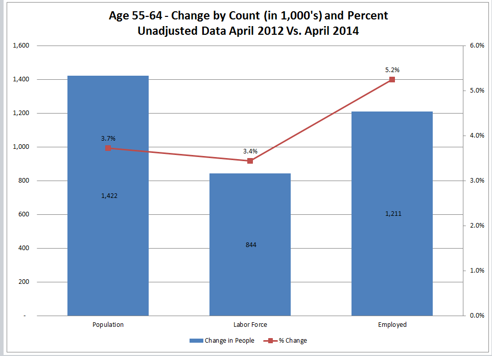
Population in age group 55-64 is up by 1,422,000 and employment is up by 1,211,000. Percentage-wise population is up by 3.7%, while employment is up 5.2%. This is a huge difference compared to stats for the core age group 25-54. We would need a finer breakdown to see if retirement is pushed back in the 62-64 age group but other evidence, notably the 65+ age group strongly suggests just that.
…