

Courtesy of Mish.
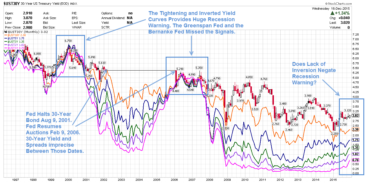
Inquiring minds may be interested in a detailed look at the yield curve and spreads between various durations following the Fed’s Wednesday rate hike. Let’s start with a long-term chart from 1996 to 2015.
Yield Curve 1996-Present
click on any chart for much sharper image
Legend
- Red-Black: 30-Year Yield
- Orange: 10-Year Yield
- Blue: 5-Year Yield
- Green: 3-Year Yield
- Purple: 2-Year Yield
- Pink: 1-Year Yield
Notes
- The above chart shows month-end closing yields except for December 2015 which is as of December 18.
- The Fed stopped 30-year bond auctions on August 9, 2001.
- The Fed resumed 30-year bond auctions on February 9, 2006.
- The yield and various spreads on the 30-year bond are imprecise between those dates.
Spotlight on Spreads and Inversions
It is very difficult to see spreads and inversions over such a long duration in the above chart. There are simply too many data points.
For ease in viewing, I took year-end closing numbers (except the current year which is as of close on December 16, the day of the hike), and plotted them in Excel.
Yield Curve 1998-2015 (Year-End Values)
…