

My Favorite Charts
Courtesy of Michael Batnick
There is so much amazing information out there that it’s just impossible to read it all. So every time J.P. Morgan updates their Guide to the Markets, I skim the first 20 or so and then give up. But this year I went through all of them and picked out my favorite slides, for your viewing pleasure.
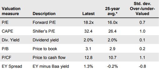
1. It’s pretty wild that the CAPE has averaged 26.4 (long-term average 16) for the last 25 years, especially when you consider that we had two 50% crashes. In 2003, it only got down to a low of 20.75, after peaking at 47 in March 2000. In February 2009, it fell to a low of 12.4, which was as low as it had been since 1985. For more CAPE data, see this neat tool from Barclays.
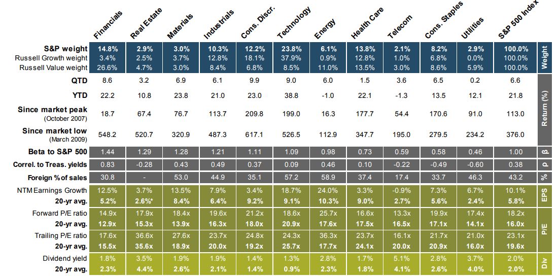
2. There’s a lot going on in this one. The thing that stood out most to me was “since market low.” I would have thought that financials have had the best returns since March 2009, and was surprised to see that consumer discretionary has done better, returning 617% (oh my god 617%) compared with 548% for financials.
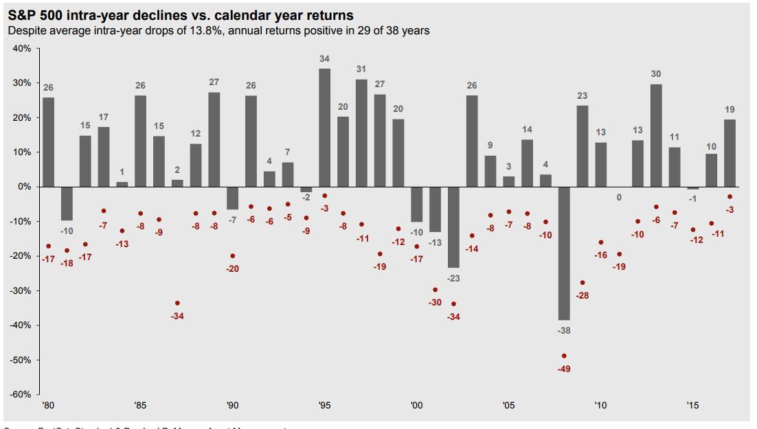
3. This one is a fan favorite. Last year was wild. Also pretty nuts to think that stocks have been up 12 of the last 14 years (13 of 14 including dividends).
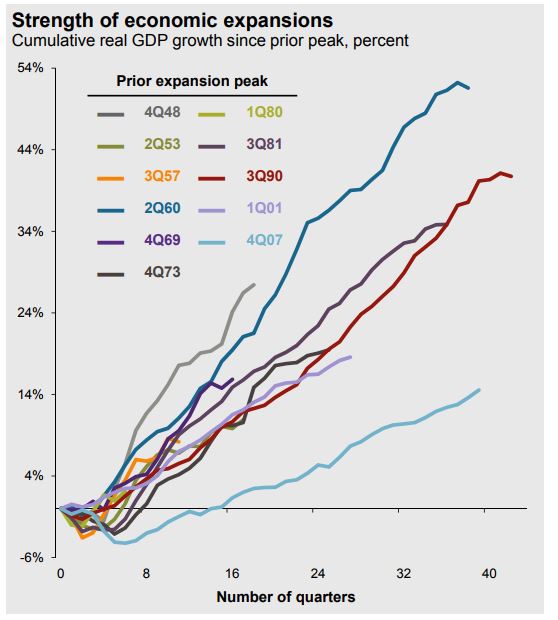
4. This has been a long recovery, approaching record territory, but it hasn’t been an especially strong one.
5. Prettay, prettay, prettay good.

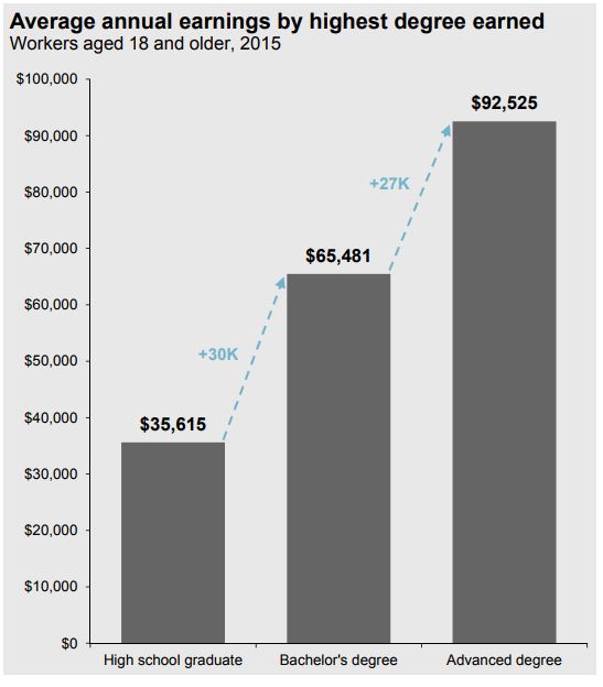
6. Stating the obvious, education matters, a lot.
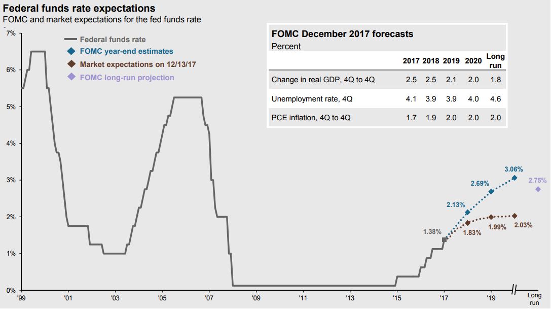
7. We’ve had easy money for a long time.
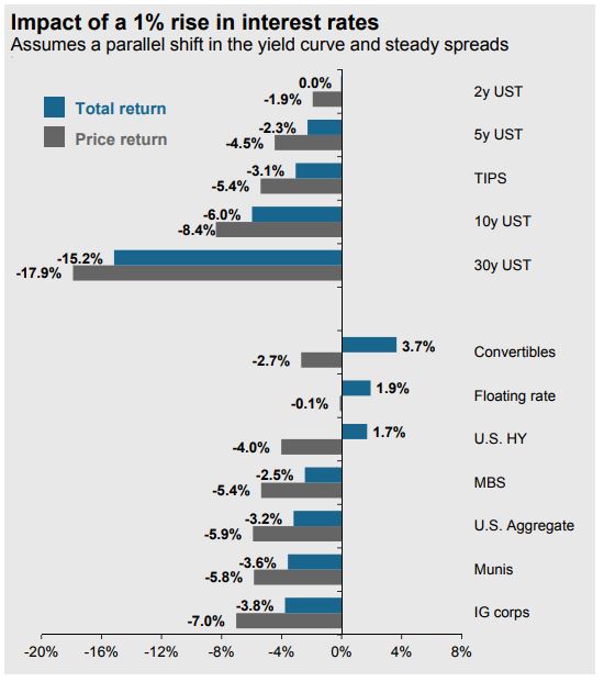
8. How a 1% parallel shift (meaning every part of the curve shifts by 1%) affects bonds.
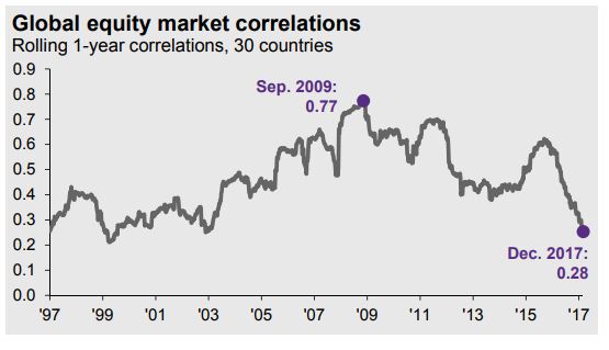
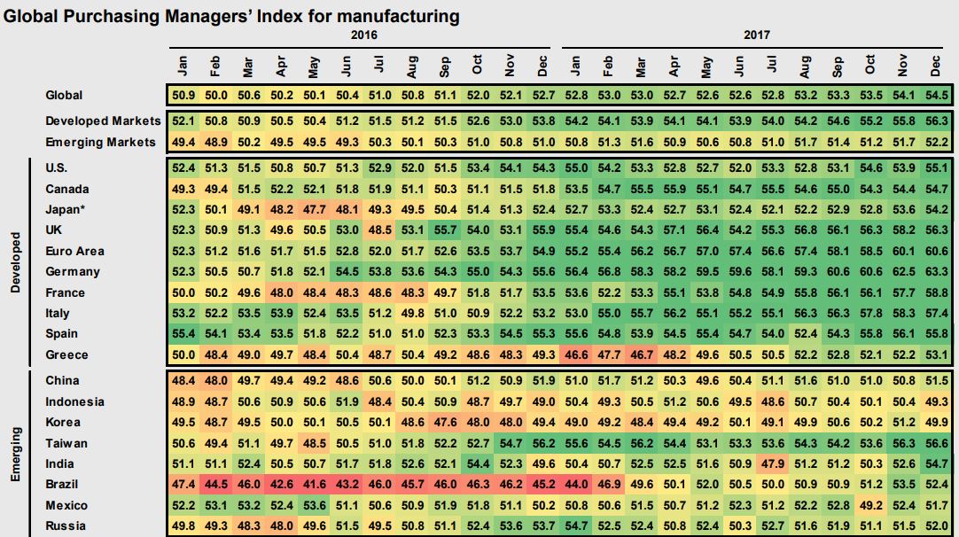
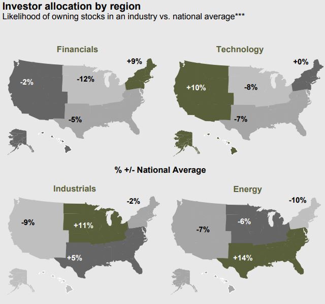
9. It’s a country picker’s market.
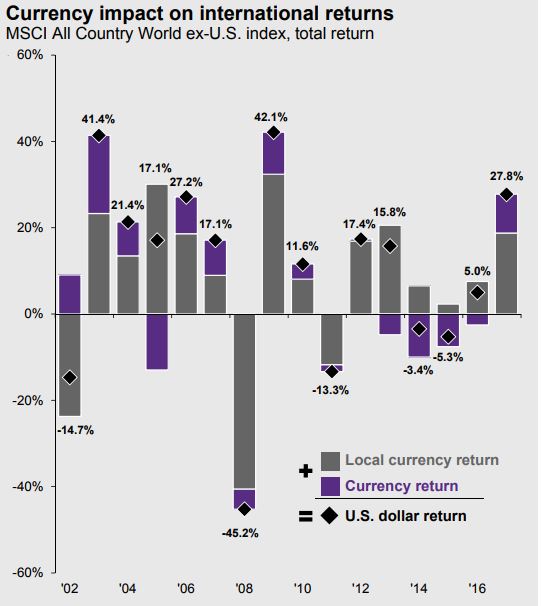
10. A falling dollar was a tailwind for U.S. global investors for the first time since 2010.
11. That’s a lot of green.
12. Eurozone unemployment is going in the right direction.

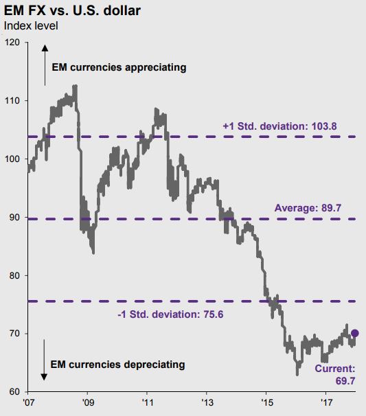
13. EM currencies have gotten crushed, relative to the dollar. A sustained bounce could help U.S. investors who allocate to emerging markets.
14. The 1950’s were incredible for stocks.

15. Asset allocation- never the best, never the worst, usually good enough.

16. This is a scary chart.
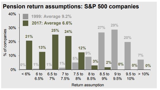
17. In 1999, no pensions assumed they’d earn less than 6% a year, today, 21% are making that assumption. In 1999, 83% of pensions assumed they would earn more than 8.5% a year, today, only 2% do.
18. Our biases, in one chart.
Source: