
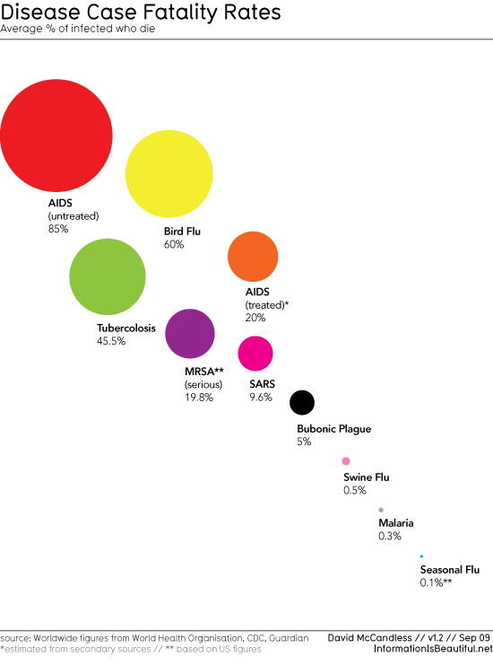
I found this at Barry Ritholtz’s The Big Picture’s "H1N1 (swine flu) Fatality Rates: Overreaction?" and had a few comments:
1. The chart compares death rates in persons infected (or known to be infected) with various pathogens. The total numbers of people who are or will be infected with these diseases are different. For example, in the U.S., the percentage of people infected with HIV is much smaller than the percentage of people who contract the flu each year; i.e., the chart shows the death rate per infected person, not death rate per person in the population.
2. The death rate reflects virulence, but is not a measure of transmissibility – or contagiousness.
3. The course of the swine flu hasn’t played out yet, so we don’t know what’s in store. Hence, to answer the question, "overreaction?" – perhaps "we’ll see" is the best answer. – Ilene
A couple more swine flu vaccines stories: here and here.