For those new to Pharmboy’s TA Book, previous chapters are: Understanding Market Cycles: The Art of Market Timing (Chapter 1), Dow’s Theory of Markets (Chapter 2), Fundamental vs. Technical Analysis and Types of Technical Trading (Chapters 3 & 4).
In his most recent Pharma sector article, Divine Device Companies, Pharmboy explains his bullish outlook for two medical device companies.
Now for Chapter 5 of Pharmboy’s TA Book. Enjoy. – Ilene
Stock Charting Basics: How to Read & Understand Stock Charts
Courtesy of Pharmboy at Phil’s Stock World
Technical analysis does not exist without charts. Charts are the most basic foundation to the art. Without a clear understanding of charts, it will be hard to master TA. Stock charts can predict future movement with a high degree of accuracy.
Petrohawk (HK), Merck (MRK), STEC Inc (STEC), and Sunpower’s (SPWRA) (Figure 17) charts will be used throughout this handbook (along with a few others). These are some of PSW’s favorite trading stocks, and many have made a nice chunk of change trading them …all by understanding what the chart was telling us and knowing the company’s fundamentals.
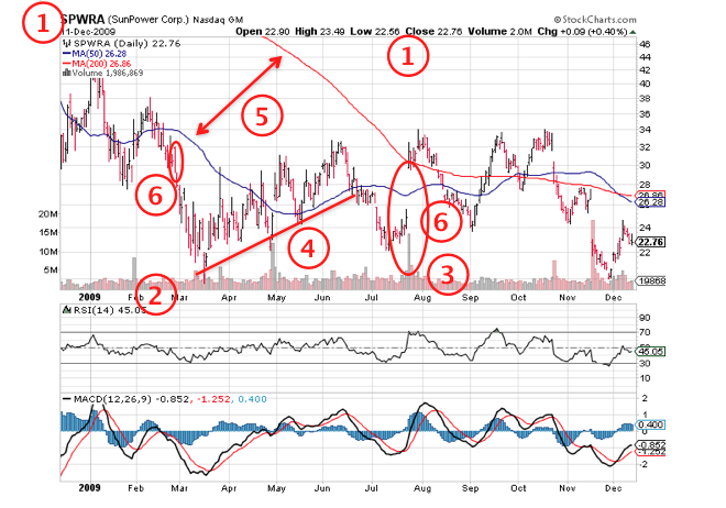
Figure 17. SPWRA bar chart.

There are 6 key components of any chart that every trader should focus on, as shown in the example above (Figure 17):
- Identification – The company name, ticker symbol, date, stock exchange, day’s price range, volume of shares traded, and percentage change are listed in a bar chart listed here. Figure 17 depicts SPWRA’s 1 year chart from December 12, 2008.
- Time Frame – In this case, a 1 year chart is used. Time frames are especially important.
- Volume – Volume tells the participation level for a particular day for a stock and is the number of shares traded during that day. Volume is used to confirm price action and spikes in volume both up and down days, mean that many traders are involved in trading the stock. Notice the massive volume spikes in May and August? A lot of shares exchanged hands that day and the significance of this and other volume signals will be touched on later.
- Trend lines – These are lines that are drawn through three or more points. The points do not have to perfectly match up, but if the trader can draw a line close enough to the trend, it’s considered valid. Figure 17 depicts a 4-month trend line from $22 to $28.
- Moving Averages – Moving averages (MA’s) smooth out average closing price over a specified period of time. In Figure 17 the 50 and 200-day MA are listed. There are also exponential moving averages (EMA’s) and others. I use 5, 20, 50 and 200 day MA are used throughout the handbook.
- Individual Days – A collection of individual days make up a chart. Many times, it is important to pay attention to each specific day. The oval depicted in Figure 17 shows a one day reversal and was the precursor to a major reversal. In March, there is a major one day reversal that forecasts another change in the prevailing trend. Do not ignore one day moves. Each day matters and can lead the way to directional changes in the stock.
The three most popular are bar charts, candlestick, and line charts. Bar charts are the most widely used and line charts the least. Candlesticks are gaining explosive popularity due to their predictive nature.
Line Charts
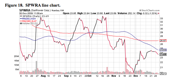
Line charts compile the closing prices of a stock and ignores the open, high, or low points of each trading day. Line charts are more suited for the longer-term trader (Figure 18).

Bar Charts
Bar charts are popular charts used by some traders. The bars formed by using the open, high, low, and close prices of that particular day (Figure 19). Sometimes they are called OHLC bar charts (Open, High, Low, Close). A second type of bar chart is called HLC. These charts do not factor in opening prices. If a trader uses a bar chart, they should use OHLC charts to see a more complete and accurate picture of the action.
Figure 19. Bar chart.

Candlestick Charts
Candlesticks are usually composed of the body (black or white), and an upper and a lower shadow (wick). The wick illustrates the highest and lowest traded prices of a security during the time interval represented. The body illustrates the opening and closing trades. If the security closed higher than it opened, the body is white or unfilled, with the opening price at the bottom of the body and the closing price at the top. If the security closed lower than it opened, the body is black, with the opening price at the top and the closing price at the bottom. A candlestick need not have either a body or a wick (Figure 20). .
To better highlight price movements, modern candlestick charts (especially those displayed digitally) often replace the black or white of the candlestick body with colors such as red (for a lower closing) and blue or green (for a higher closing). Candlestick charts will be used almost exclusively throughout the rest of this handbook.

Trading Time Frames
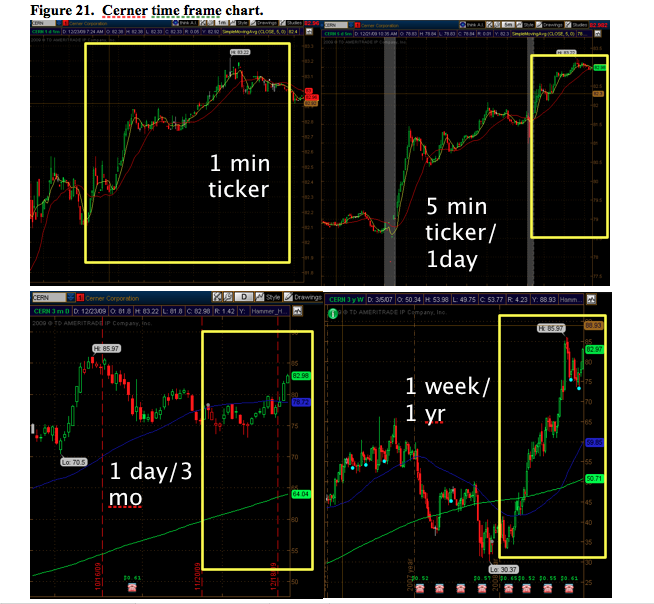
There are many different time frames to choose from. There are charts in 1-minute, 5-minute, 10-minute increments, or 1-day, 3-day, 5-day increments all the way up to several months and years. The trader must use the chart with the time frame that meet their trading needs. For instance, a day trader should not use monthly charts, and a position trader should not use 1-minute increment charts. In fact, following the wrong time frame for a specific strategy increases the risk of losing on trades. By using the appropriate time frame a trader can increase their chances for success. Examples of time frames (bar increment / window increment) for each strategy are as follows:
Scalping (micro-trading) – 1-minute/60-minutes only
Day Trading – 1-min/60-mins, 1-minute/120-minutes, 5-minutes/1-day
Swing & Momentum trading – 1-minute/180-minutes, 5-minutes/1-day, 10-minutes/3-days, monthly
Position trading – 5-minutes/1-day, 10-minutes/3-day, monthly
Figure 21 shows examples of these time frames in chart form of Cerner (CERN):

Time frames will help tie an entry, but finding an actual entry signal is the challenge. For now, use the right time frame chart with the right strategy.
Stock volume is extremely important because volume confirms price action. Volume tells the trader the excitement or participation level for a stock. Here are simple rules for volume:
- Volume Confirms Price Action – When volume increases, price increases higher or lower. If volume decreases, price decreases.
- Price/Volume Divergence – If price does not increase when volume increases, then there is a divergence. Typically, there is a sharp movement in the stock the following day.
- Breakout Expansion – When a stock breaks out from consolidation, above average volume should accompany the move. Breakouts on low volume usually do not last and the price reverts to its previous level.
- Consolidation Contraction – When a stock consolidates after a breakout, volume should contract, or decline. This shows healthy consolidation and that buyers are still holding the stock and there are not that many sellers. These consolidation areas typically precede more breakouts on massive volume trading.
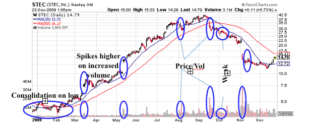
Let’s take a look STEC again (Figure 22), but this time, by analyzing its volume:
Figure 22. STEC volume analysis chart.

Traders can use volume signals to analyze a stock. This chart shows breakouts on large volume, consolidations on low volume, price-volume divergences, and price-volume confirmations. The power of TA is that one simple chart can give extremely valuable, tradable information. After analyzing hundreds of charts, a trader should be able to determine whether or not a stock is a good trade within a matter of seconds. The key is to keep looking at charts and to practice.


