Courtesy of Doug Short
Note from dshort: Yields have seen some high volatility over the past month, especially the 2, 3, and 5-year Notes. The fourth chart below (percent change) clearly illustrates this phenomenon. The outbreak of turmoil in the Middle East could well be a factor in the future outcome of this volatility.
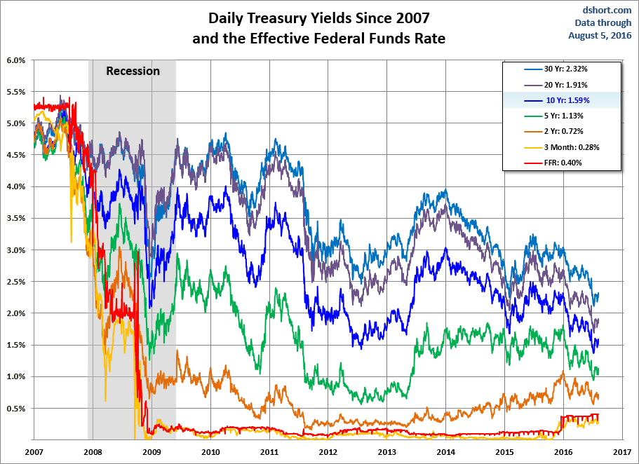
The behavior of Treasuries is an area of special interest in light of the Fed’s QE2 strategy. The first chart shows the daily performance of several Treasuries and the Fed Funds Rate (FFR) since 2007. The source for the yields is the Daily Treasury Yield Curve Rates from the US Department of the Treasury and the New York Fed’s website for the FFR.
Here’s a closer look at the past year with the 30-year mortgage added to the mix.
Here’s a comparison of the yield curve at the time of the Fed’s QE2 announcement and the latest curve.

How much have yields risen? This chart shows the percent change over the same timeframe for a basket of eight Treasuries. I’ve highlighted the volatility of the past month for some of the Notes (2, 3, and 5 especially).
The yield spread had been widening in November and much of December. However some of the yields (the 2-, 3-, 5- and 7-year) have contracted slightly over the past two weeks. The next chart shows the 2- and 10-year yields with the 2-10 spread highlighted in the background.
The final chart is an overlay of the CBOE Interest Rate 10-Year Treasury Note (TNX) and the S&P 500.
For a long-term view of weekly Treasury yields, also focusing on the 10-year, see my Treasury Yields in Perspective.


