
Technical analysis dates back hundreds of years. According to historical records, a great Japanese rice trader named Homma Munehisa (1724-1803) developed a form of TA known as candlestick charting.1 A candlestick chart is a style of bar-chart used primarily to describe price movements of securities, derivatives, and currencies over time. It combines aspects of a line-chart and a bar-chart, in that each bar represents the range of price movement over a given time interval. It is most often used in TA of equity and currency price patterns.
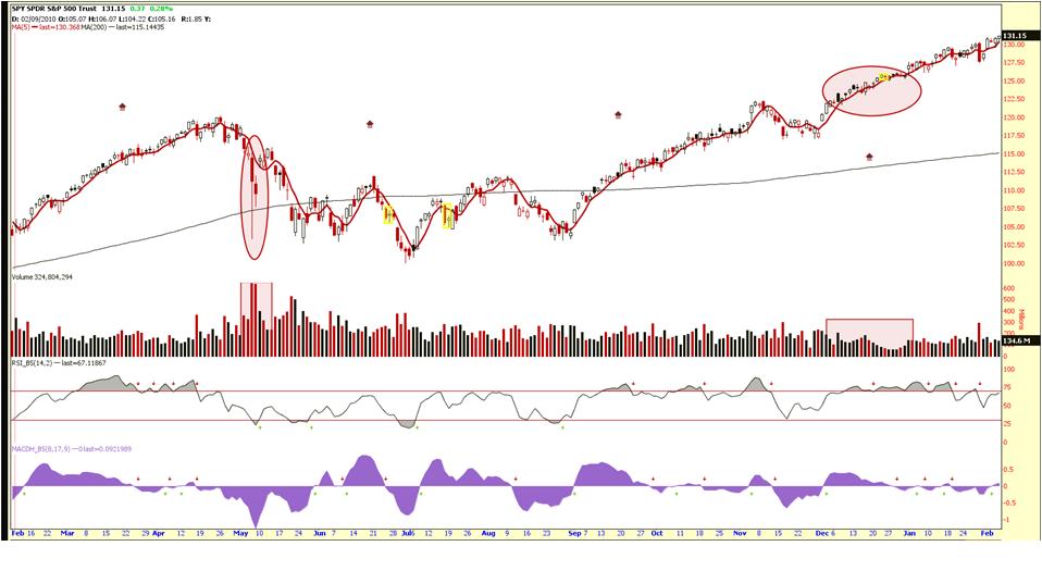
Technical analysis is an art. With focus and diligence, TA can often be learned within a short period. A chartist using TA reads and interprets chart patterns and then attempts to predict the most likely short-term outcome based on his methods. Figure 5 shows a 6 month Diamonds (DIA) candlestick chart and many patterns and studies that traders often use to enhance their trading. Moving averages convergence divergence (MACD) and relative strength index (RSI) are two studies very commonly used by technical analysts. MACD is a trend-following momentum indicator that shows the relationship between two moving averages of prices, while RSI is a technical momentum indicator that compares the magnitude of recent gains to recent losses in trying to decide overbought and oversold conditions of an asset. Because candlestick charting is the basis of this handbook, these types of charts are used almost exclusively in the examples.
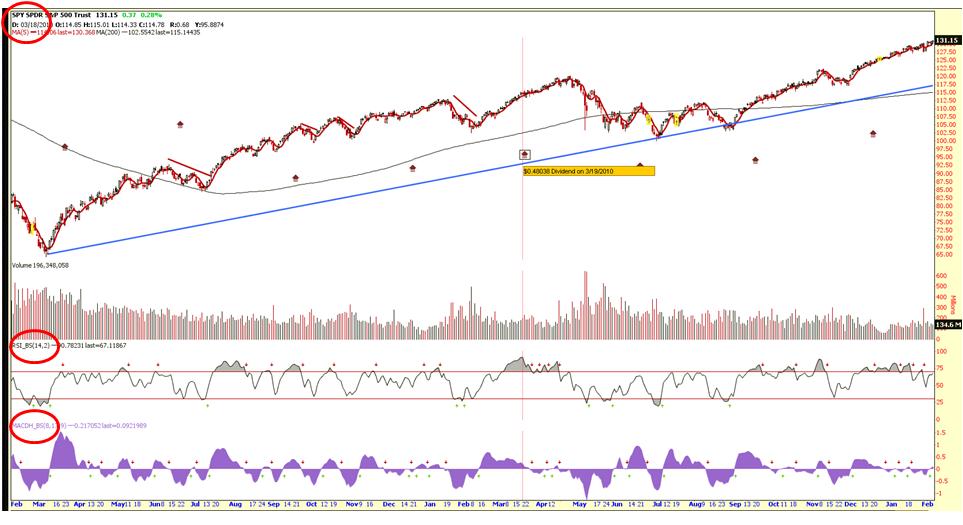
Figure 1. Candlestick chart with 5 and 200d MA. Below are the MACD and RSI.
In the U.S., TA first gained a following from Charles Dow’s Dow Theory in the late 19th century. The six basic tenets of Dow Theory, as summarized by Hamilton, Rhea, and Schaefer, are described below:
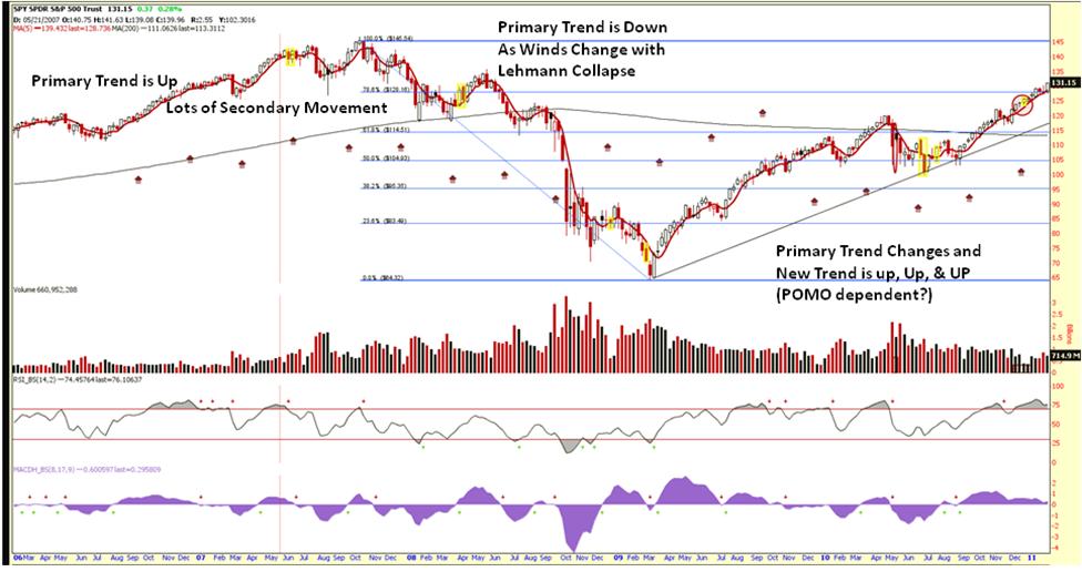
Tenant 1. The market has three movements (Figure 2):
- The primary trend, or major trend, may last from less than a year to several years. It is bullish or bearish.
- A secondary trend moves in the opposite direction of the primary trend, or as a correction to the primary trend. For example, an upward primary trend will be composed of secondary downward trends. This is the movement from a consecutively lower high to a consecutively higher high. In a primary downward trend the secondary trend will be an upward move, or a rally. This is the movement from a consecutively higher low to a consecutively lower low. The secondary reaction, or intermediate reaction, may last from ten days to three months. It generally retraces 33% to 66% of the primary price change from the primary movement.
- The last of the three trend types in Dow’s theory is the minor trend, which is defined as a market movement lasting less than three weeks. The minor trend is generally the corrective moves within a secondary trend, or those moves that go against the direction of the secondary trend. The minor trends are not depicted in Figure 2.
Figure 2. Primary and secondary movements of S&P 500 Spiders Index (SPY).
.jpg)
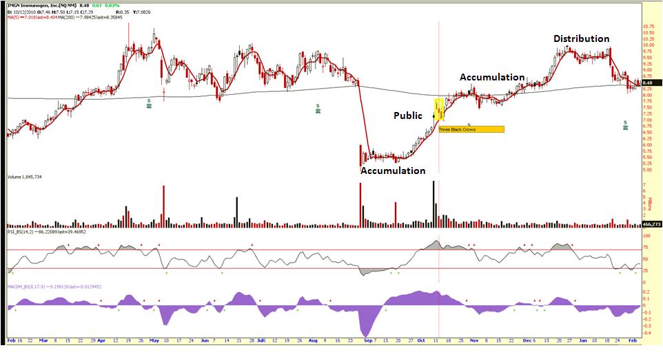
Tenant 2. Major market trends are composed of three phases the accumulation, public, and distribution phases (Figure 3).
- Accumulation phase (or phase I, also described as “smart money” going into a security ) is a period when investors “in the know” are actively buying (selling) stock against the general opinion of the market. During this phase, the stock price does not change much because these investors are in the minority absorbing (releasing) stock that the market at large is supplying (buying).
- Eventually, the market catches on to these astute investors and a rapid price change occurs called the public phase (phase II). This occurs when trend followers and other technically oriented investors participate. This phase often ends in rampant speculation.
- At this point, the early investors/”smart money” begin the distribution phase as they dispense their holdings to the market (phase III).
Figure 3. Three phases of the market for IMGN.
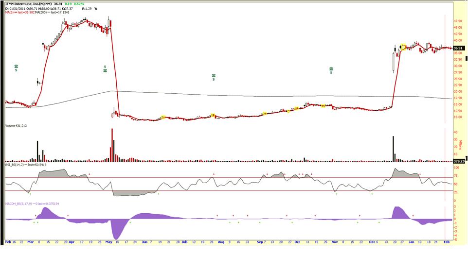
Tenant 3. Stock prices quickly incorporate new information as soon as it becomes available. Once news is released, stock prices will change to reflect this new information as traders rush into or out of the stock. Sharp stock price increases and decreases are noted in Figure 4 on regulatory releases of ITMN.
Figure 4. ITMN PDUFA, FDA and EU announcement gaps.
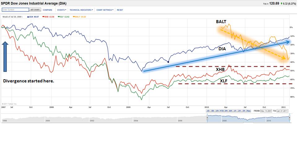
Tenant 4. Stock market averages should confirm each other. In Dow’s time, the US was a growing industrial power with factories scattered throughout the country. Factories had to ship their goods to market, usually by rail. Dow’s first stock averages were an index of industrial (manufacturing) companies and rail companies. To Dow, a bull market in industrials could not occur unless the railway sector rallied as well, usually first. If manufacturers’ profits were rising, they were producing more. If they produced more, they would also ship more goods to consumers. Hence, an investor looking for signs of health in manufacturers would also consider the performance of railroad companies. The two sectors should move in the same direction. When the performances of the averages diverged, it is a warning of a change. Recently, in 2010, the dry bulk shippers (using BALT as the comparator index for the Baltic Dry Index) and the Diamonds EFT (DIA) for the ‘goods’ of many companies have diverged. In another example, the DIAs were moving sideways, but in the beginning of 2007, a divergence occurred in the banking (XLF) and homebuilding sectors (XHB) warning that something had changed (Figure 5). While the Dow Jones Industrials were setting a new high in late 2007, the housing sector (XHB) had already started diverging from XLF, and in Q2 2007, the XLF pulled away from the Dow Jones Industrials. Lehman Brothers collapsed in September 2008. Currently in early 2011, transports (EGLE, BALT, GNK, etc) are all pointing down, and the other indexes (SPY, DIA, RUT, QQQQ) are moving up.
Figure 5. Divergence of BALT and DIA.
Tenant 5. Dow believed that volume confirmed price trends, but explanations vary when prices move on low volume (Figure 6). For example, an aggressive seller could be flooding the market with sell orders. When price movements are accompanied by high volume, Dow believed this represented the “true” market view. If multiple participants are active in a particular security, and the price moves significantly in one direction, Dow maintained that this was the direction in which the market anticipated continued movement. To him, it was a signal that a trend was developing.
Figure 6. SPY volume declines as price increases and vice versa.
Tenant 6. Trends exist despite “market noise” (Figure 7). Markets might temporarily move in the direction opposite to the trend, but will soon resume the prior move. The trend should be given the benefit of the doubt during periods of uncertainty. To determine if a reversal is the start of a new trend or a temporary movement in the current trend is a difficult task. Technical analysis tools help investors attempting to make the distinction. Nevertheless, market participants often come to different conclusions based on the same chart patterns and analytical tools. (Hence, charting is an art, or a craft, not a science.)
Figure 7. Market Trend (2007 – 2011).
1Candlestick Charting Explained: Timeless Techniques for Trading Stocks and Futures, Gregory L. Morris, McGraw-Hill, 2006,