Courtesy of Lee Adler of the Wall Street Examiner
The Labor Department reported that seasonally adjusted (SA) first time claims for unemployment were down 12,000 at 365,000 in the advance report for the week ended September1. That beat the consensus estimate of 373,000.
Actual claims, not seasonally adjusted (NSA-the actual total of individual state counts submitted to the Department of Labor) were 310,000 (rounded) including the addition of 2,000 claims to adjust for incomplete state counts that do not include interstate claims at the time of the advance release. This week was better than the same week a year ago when new claims totaled 349,000. The current week was also better than the average of the last 10 years’ claims for this week of 324,000. Approximately 39,000 (11.1%) fewer people filed first time claims this year than in the same week in 2011. On a week to week basis, claims were down by approximately 2,000.
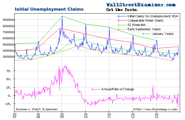
To avoid the confusion inherent in the fictitious SA data, I ignore it and analyze the actual numbers of claims filed that week as counted by the 50 states and submitted to the Department of Labor. It is a simple matter to extract the trend from the actual data (NSA) and compare the latest week’s actual performance to the trend, to last year, and to the average performance for the week over the prior 10 years. It’s easy to see graphically whether the trend is accelerating, decelerating, or about the same. This week it’s about the same.
This week’s data continues to be consistent with the improving trend of the past two years. It is well within the range of weekly fluctuations in the annual rate of change from -3% to -20% since mid 2010. Since mid 2011, in most weeks the annual rate of change has been within a couple of percent of -10%. The trend has been remarkably consistent.
Looking back 10 years, the current week has shown both decreases and increases. The week to week changes have usually been small. The current week to week change was a decline of around 2,000, depending on how close my adjusted figure is to the final number to be reported next week. That compares with a prior 10 year average of an increase of 5,400 for the week. Last year claims rose by 11,900 for the same week. In September 2010, when the economy was rebounding from the worst part of the recession, they fell by 1,300. The current numbers compare very favorably with the past couple of years and the 10 year average.
As plotted on a chart, this week’s data shows that the trend is still improving (chart below). The rate of improvement is now slightly faster than the prior early September reading from 2010 to 2011. This is probably just a normal fluctuation.
The consistency is clear in the annual rate of change graph. The rate of decrease in new claims continues to hover near the -10% axis. The current year to year decline of 11.1% remains near the middle of the range of the rate of change over the past 2 years. The Fed has no reason for additional QE (more in depth analysis in the Professional Edition Fed Report). Only if the rate of decrease shrinks to less than 2.8% would the Fed have greater impetus to move. Bernanke is jawboning the market to act as if QE is coming, but it seems unlikely given this data, and today’s ADP data, as well as the threat of higher commodity prices that more QE would probably spur.
As the number of workers eligible for unemployment compensation has trended up since 2009, the percentage of workers filing first time claims has continued to decline. Comparing the yearly line for this data for the current week to the 52 week moving average, the trend of improvement continues to track at a steady rate. The current level is near the level of 2003-04, the last non-bubble, “normal” year. By this standard, the current level of claims is “normal.”
Lately, economists have been arguing about the “natural” unemployment rate. I think we’re at it now. If we recognize that the bubble period with its millions of fake jobs was abnormal, then the low level of claims during those years was also abnormal. Where we are today is probably normal and the expectation that the US will ever get back to 6% unemployment is a false hope.
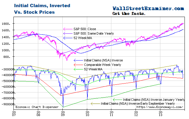
Plotted on an inverse scale, the correlation of the trend of claims with the trend of stock prices over the longer term is strong, while allowing for wide intermediate term swings in stock prices. Both trends are largely driven by the Fed’s operations with Primary Dealers (covered weekly in the Professional Edition Fed Report; See also The Conomy Game, a free report.) This chart suggests that as long as this trend in claims is intact, the S&P would be overbought at approximately 1450, and oversold at roughly 1200. The market is now very close to the overbought parameter. Barring a much stronger improvement in the claims data that would suggest accelerating growth, the market will be at greater risk of a correction in the next few months. [I cover the technical side of the market in the Professional Edition Daily Market Updates.]
The chart below gives a longer term perspective on claims. The trend has been improving while remaining above the bubble years with their 10 million fake jobs taking orders for new and unneeded condos and houses, building them, permitting and inspecting them, and taking and processing mortgage applications.
The punditry consensus estimate missed again this week, as usual. How is it that conomists can be surprised so often? Easy. They are looking at bad data–the SA data. Seasonal adjustment factors for this week have varied over the last 10 years from 1.178 to 1.274. The range of variance is over 9%, which is much less than many weeks when the variance is as much as 20%, but still a huge range. This week’s factor was 1.186. (False Claims and Absurdities of Mainstream Media Reports On Initial Unemployment Claims).
The following chart is a picture of reality versus the the Impressionist art of seasonal adjustments. Sometimes the SA data represents reality to some degree, and sometimes it doesn’t. If you are following only The SA data, at any given time you have no way of knowing which it is. One thing is certain– it is not photo-realism.
There are ways to measure trends using actual data. One way is to show the year to year line as of the current and corresponding date, as shown on the chart below, as well as the first four charts above. Another is to view the annual rate of change as shown in the first chart above.
The arbitrary seasonal adjustment process has often raised false alarms.There were big counter trend pops early in the second half of 2010 and in the second quarter last year. In the July 7 week it gave a false positive reading, which conomists furiously tried to explain away with some nonsense about auto plant shutdown timing, when the explanation was far more mundane. The SA data was just wrong.
The trend of the SA data often goes off track for months at a time, giving a false picture. That has been the case for most of this year. The trend of the SA data through September 1 has been flat since February, implying that the trend is not improving, while the actual trend has remained down (improving). First time claims are actually doing better than the impression given by the trend of the SA data, which is why conomists have been constantly confused.
I think it’s interesting that the ADP private payrolls data for August was such a huge surprise. This may have been a case where the SA data was finally forced to catch up with the trend of recent months, but the real unadjusted data, which is not made public, was probably not as good as the headline number implied. The Federal withholding tax data for the payrolls reference week of August 12 was very weak. Given that nonfarm payrolls have suffered the same problem of the SA data understating the trend of improvement in payrolls over the past few months the SA data could also play catch up for August. A relatively weak actual NSA number could still result in an upside surprise in the SA headline number.
Even though the actual data has not warranted more Fed Quantitative Easing, i.e. money printing, as economists and Wall Street have become increasingly confused by the bad data, the drumbeat for it has grown louder. Bernanke has been hearing the sound of those drums and singing his song to them, but more QE is not not needed and not justified. I think that the Fed knows that.
For long term charts and other measures of initial claims and other employment measures visit the permanent Employment Charts page, updated whenever new data becomes available. Be sure to check out the section on real time Federal withholding taxes which I just update. It suggests that in spite of weakness in withholding versus July, the headline jobs number could surprise on the upside.
Get regular updates the machinations of the Fed, Treasury, Primary Dealers and foreign central banks in the US market, in the Fed Report in the Professional Edition, Money Liquidity, and Real Estate Package. Click this link to try WSE's Professional Edition risk free for 30 days!
Copyright © 2012 The Wall Street Examiner. All Rights Reserved. The above may be reposted with attribution and a prominent link to the Wall Street Examiner.


