

Before you get excited about the big reversal…
Courtesy of Joshua M Brown
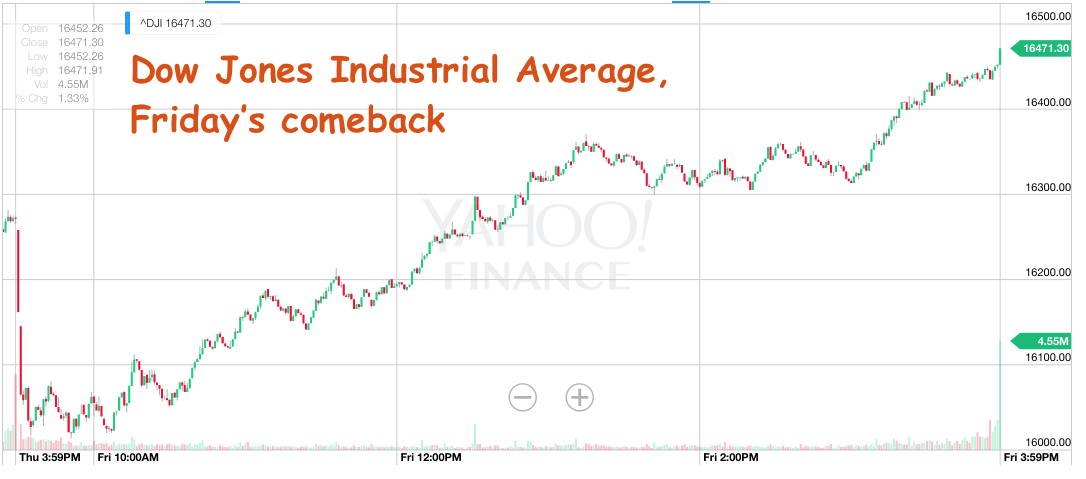
There was a lot of excitement about the market’s dramatic reversal to the upside on Friday. What began as a down 250-open for the Dow Jones Industrial Average ended with an up-200 close. It is understandable to see investors cheering this type of action – it’s quite a relief to see early morning losses turn to gains so quickly and forcefully.
Unfortunately, it would be ahistorical to think that this is somehow indicative of the resumption of the bull market. The reality is that the biggest intraday point swings in history have all taken place in the context of downtrends and bear markets.
The below table goes back to 1987 and obviously points are not the same as percentages, but I think you’ll get the idea:
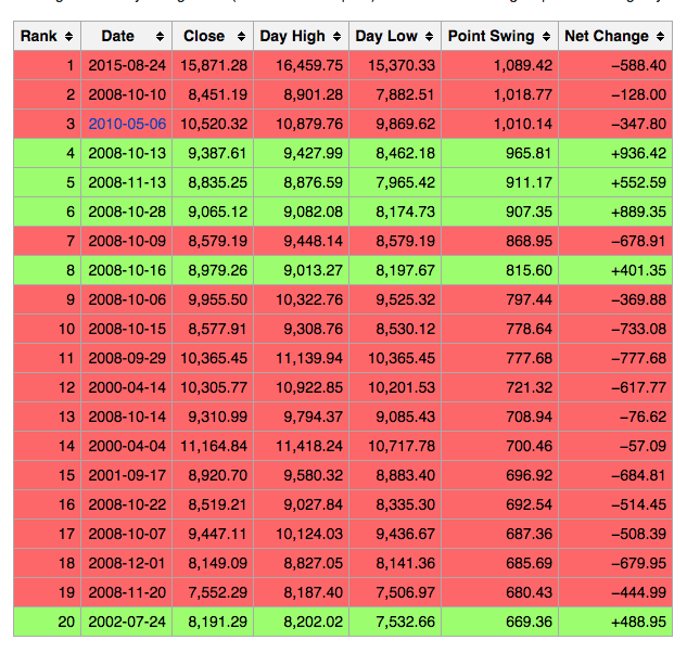
15 of these 20 large intraday point swings for the Dow occurred on days during which the Dow ended with a loss, 5 of 20 were on up-days. Every single of one of these large swings took place during a market crash (we can debate the 2010 “Flash Crash” on the merits of time frame) save for the latest entrant, August 24th of this year. 9 of the top 10 intraday point swings took place during the infamous 4th quarter of 2008.
The point is that massive intraday point swings, regardless of direction, are not synonymous with “healthy” action, they are indicative of deep confusion and fear within the various layers of the investor class firmament. Friday’s action could be the beginning of a classic October “Bear-killer” rally, but it is way to soon to be drawing that conclusion.
Why? Because there’s still a lot of work to do within the stock market, not just on price itself.
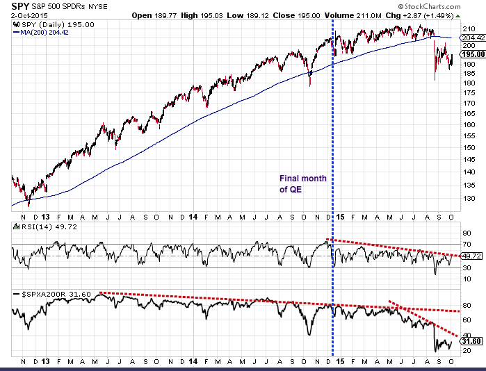
The next chart I created is meant to show that the episode we’re contending with now has been long in the making. Anyone searching for day to day “reasons” as to why the market makes a volatile move would do well to understand that the internals had been portending the correction for a long time now; the sins beneath the surface had been piling up, despite the seemingly benign lack of volatility above.
In the top pane is a 3-year chart of the S&P 500 SPDR ETF with its long-term trend line (in blue). You’ll also see the dashed line indicating the final month of QE, just as the taper of Fed stimulus was finishing up.
In the second pane below, you’ll note that this coincided perfectly with the peak in relative strength (RSI 14), a measure of momentum. The buying became progressively less spirited with every passing week, regardless of the market’s new highs this spring. This is what’s called a negative divergence (red dashed trendline).
In the third pane, at the bottom, you’ll see another, even more damning negative divergence when looking at the percentage of S&P 500 stocks above their 200-day moving average. This measure peaked in mid-2013 and never fully recovered, as the rally became more and more specialized (narrow) and fewer names were participating in the parade. Then the already waning trend completely fell off a cliff this July, which perfectly presaged the August-September rout.
Some takeaways:
The first is that bull markets cannot run on weakening momentum and narrowing participation forever. We learn and re-learn this lesson again and again.
The second is that big one-day rallies and price swings are characteristic of downtrends, not bull markets. There have been almost 100 days since the S&P 500 put in its all-time high in May. Ever since then, one out of every four days has seen a triple-digit point move in the Dow – many of them positive. And still we’re down 5% year-to-date and more than 8% from the highs.
The short-term trend for US stocks as a whole is still down. We have a downward-sloping simple 200-day moving average for the first time in almost four years. That could change in two ways – a run back toward the highs of May would drag that slope into an upturn. Or, a sustained period of chopping around the present levels would flatten it out after several months. But until that happens, stocks are guilty, not innocent.
The range of potential outcomes broadens out while the S&P 500 is below its long-term trend. And by broadens out, I mean in a bad way. Michael Batnick, my firm’s director of research demonstrated this concept back in July:
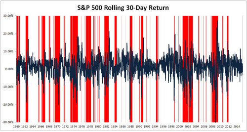
When bad things have happened, they tended to do so below the 200-day. Since 1960, 22 of the 25 worst days have occurred below the 200-day moving average. Of the 100 worst single days over the last 55 years, 83 of them happened while stocks were below the 200-day.
The chart below shows the rolling thirty-day return for the S&P 500. Areas highlighted in red are when stocks are below the 200-day. What you’ll notice is that this is where the vast majority of negative spikes occurred.The average 30-day return going back to 1960 is 0.88%. The average 30-day return when stocks are below the 200-day is -2.60%.
Josh here – now, whether or not these takeaways are meaningful to you is a function of your time frame, your tolerance for volatility, the particular investment strategy you employ and the level of leverage you’ve got on at the moment. This will be different from person to person.
The key is to be aware of the present situation and then to think about your own situation, objectively, through this lens.