

Courtesy of Doug Short’s Advisor Perspectives.
Visitors to Advisor Perspectives will recognize the S&P Composite Stock Price Index as a regular feature in our long-term charts of market and economic happenings. We’re referring to the data series made popular in recent years by Yale Professor Robert Shiller, not to be confused with the S&P Composite 1500, an index that combines the S&P 500, the S&P Mid Cap 400, and the S&P Small Cap 600.
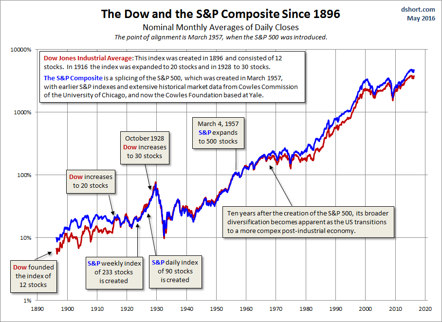
Here’s a an overlay of the Dow and the S&P Composite from May of 1896, the month the Dow Jones Industrial Average index of 12 stocks was established. The annotations highlight the growth of these two indexes over time, and the chart itself shows the context for the recognition of the S&P Composite as the preferred ultra-long-term indicator for the US equities market.
Background on the S&P Composite
The composite index is just that, a composition that splices the S&P 500, which started in March 1957, with historical data that included the companies in the S&P 90, founded in 1926, the S&P 233 weekly index dating from 1923, and earlier market data painstakingly gathered by Alfred Cowles. Cowles used family money to found the Cowles Foundation and was responsible for collecting comprehensive US stock data from 1871 to 1930. His magnum opus, the 2nd edition of his Common Stock Index was published in 1939 and is now available online in PDF format.
The S&P Composite has been popularized by Yale Professor Robert Shiller, and an Excel copy of the data, updated monthly, is maintained at his Yale website.
Making the Chart
For an apples-to-apples comparison of the Dow and the Composite, we downloaded the complete daily Dow data from the Dow Jones website. Because the Composite index is based on the monthly averages of daily closes, we made an equivalent data series for the Dow.
In order to make the two indexes overlay, we picked one data point, March 1957, the month when the S&P 500 was launched, to adjust both series to the same value, 100% (the March 1957 data point divided by the same data point expressed as a percent). We then chained both series to their respective March data point by making it a constant divisor. Voila!
As the chart above illustrates, the pre-1957 Composite mirrored the Dow very closely as far back as 1916, the year the Dow was expanded from 12 to 20 stocks (a two-thirds increase in the number of components). As we might expect, the earlier Dow 12 exhibited significantly more volatility than the much broader Composite. Even during the period of close mirroring, it’s possible to see the greater volatility of the smaller Dow. For example, the Dow peak in 1929 and bottom in 1932 were slightly more extreme than the Composite. You can also see some slight outperformance in the middle years of the Roaring Twenties and again with the outbreak in Europe of World War II.
More conspicuous is the parting of ways between the two indexes about a decade after the S&P 500 was launched. Based on the March 1957 overlay formula, the S&P index moved permanently (thus far) ahead of the Dow in December 1960, although the Dow monthly averages of daily closes came within 1.6% of matching the S&P in January 1966.
Why the outperformance of the S&P 500 since the 1960s? Some may argue that the indexing method made the difference: a price-weighted average of 30 stocks versus a market value-weighted index of 500 stocks. We would counter that the greater diversification on the broader index is the true explanation. An examination of the Dow components suggests that the index retained its industrial tilt well into the post-industrial economy, and it still excludes transportation and utilities. But even with the addition of more non-industrial companies and the evolution of several Dow components from former smokestack industries into multi-national conglomerates, 30 stocks cannot provide the same diversification as 500 in an increasingly complex world economy.
Is the S&P Composite a Valid Index?
The chart of the data certainly supports the validity of this constructed index. It is the most historically reliable single metric of the US market over the past 140 years for both price and dividends. The early Dow 12 was too small and volatile to be a proxy for the broader US market, and the Dow of the past few decades also lacks sufficient diversification to be the best single gauge of the US equities market.
Anyone who is interested in long-term trends, economic cycles, and the impact of history on the markets should be grateful to the work of Alfred Cowles and modern scholars, such as Robert Shiller, for popularizing this resource.


