

Two Charts That Don’t Matter
Courtesy of Michael Batnick
This time last year we were on the doorstep of a bear market. Or were we? The decline in stocks in the fourth quarter of 2018 won’t make it into the textbooks because on a closing basis, stocks never fell 20%. But as you can see, if we go from high to low on an intraday basis, then stocks did break the plane.

To me this is tom-ay-toe tom-ah-toe. If you’re going to make the argument that this wasn’t a bear market, then it should have less to do with depth and more to do with duration. It took three months to fall and just four months to make it all back. It was over before we knew it.
It’s one year later and remarkably, stocks are at all-time highs. But after a 35% advance, some people are wondering, did we come too far too fast? Time will tell, but the good news is that returns in one year have no bearing on what happens in the following year. This chart, produced by Nick Maggiulli, shows the 12-month return on the horizontal axis with the 12-month forward return on the vertical axis.
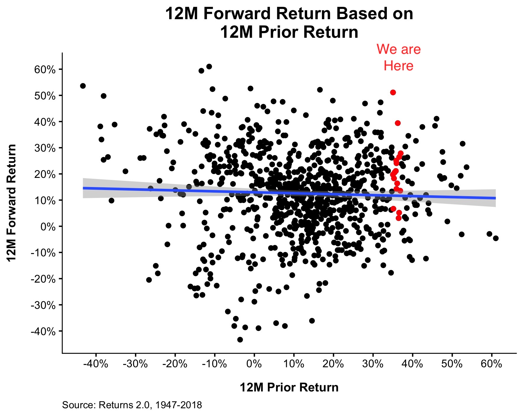
The red dots show every time that stocks experienced the type of gain we just saw over the last 12 months. Clearly, based on history, we can make no definitive statement one way or the other.
I want to thank everybody for reading and sharing my work in 2019, and I’m wishing you all a very happy, healthy, and prosperous new year.