Chart of the Day: Personal Income and Outlays
Courtesy of Edward Harrison at Credit Writedowns
I have sifted through the most recent personal income data and wanted to show you a few charts that might indicate where we’re heading.
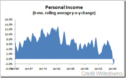
First, there is personal income. It’s fallen off a cliff since the recession began. Looking at the six-month average to smooth out blips, personal
If you notice in the chart, the steep peaks and valleys run in line with the business cycle. Right now, we are in the worst period in the 50 years of this particular data series by a large margin. The change in personal income began increasing from a low of -1.9% in July and August of 2009, where I expect the technical recession’s end date to be called.
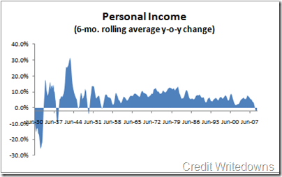
I have previous data series going back to 1929 and you can see much steeper peaks and valleys in the Great Depression (and to a lesser extent in the mini Depression of 1949). I hope the chart below gives you a sense of the difference between today and the Great Depression.
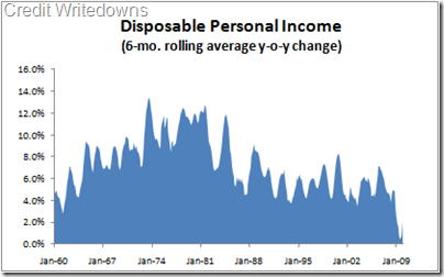
The downturn has been attenuated somewhat by tax cuts. If you look at disposable personal income, the peak was again Jun-Aug 2006 at a 7.1% change year-on-year. This plummeted to a low of 0.5% in Jul-Aug 2009 – so, not as bad as personal income, but pretty horrific nonetheless as it is the worst performance since record
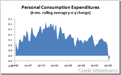
How has that all translated into consumer spending? Again, we see some serious cliff diving in Personal Consumption Expenditures (PCE) – the worst performance since record keeping began – negative year-on-year numbers for the first time ever. The interesting bit is that the downturn in consumption was well before the downturn in income. That is not the usual pattern. The peak change was 6.7% in Aug-Nov 2005. That’s a year before the summer 2006 peak in income and points to house prices as a potential reason.
In contrast, during the last recession we saw a Apr-Jul 2000 peak in PCE and a Sep 2000 peak in income. Before that, the peak was Feb 89 for PCE and Jun 1989 for income. And going back to before the 1980-82 recession, you see a peak in Sep 1978-Jan 1979 in PCE versus a peak in Aug-Oct 1978 in income. I think the fact that consumption’s peak change was a year before the peak change in income is meaningful.
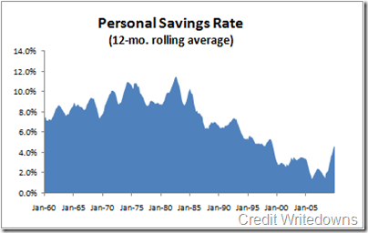
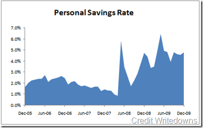
The last bit which I flashed yesterday is savings. Here are two charts. One is the long view from 1960 and the second is the short view from the last few years. I have used non-averaged month-to-month data for the second chart to show you the abrupt up-shift in personal savings.
You can see very distinctly that there was a massive spike in savings starting May 2008 as President Bush’s stimulus package came online. But, then savings cratered again, only to rise inexorably after the Indy Mac failure. More recently it has started down again.
Conclusions? Because we are looking at aggregate data, things move pretty slowly. So, when you see a pattern emerging in averaged rolling data over more than a few months, you can bet it will last. On that score, the savings rate has clearly shifted up. The low point was a 12-month average of 1.4% in April 2008. It has risen every month since.
But, the same is also true for personal income, after-tax


