ADP vs. BLS Job Reports – Who to Believe?
Courtesy of Mish
The ADP July National Employment report is out. Let’s take a look.
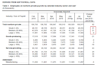
Private sector employment increased by 42,000 from June to July on a seasonally adjusted basis, according to the latest ADP National Employment Report® released today.
July’s rise in private employment was the sixth consecutive monthly gain. However, over those six months increases have averaged a modest 37,000, with no evidence of acceleration.
click on chart for sharper image
Large Businesses Added Zero Jobs
The chart shows that small and medium businesses added jobs while large businesses added a grand total of zero.
If small business hiring turns down, and I think it will, ADP is going to start reporting negative job growth.
Small Business Sentiment
The reason I expect a relapse in that small business jobs is small business sentiment is in the gutter as evidenced by recent Gallup Polls.
- Corporate Hiring No Longer Improving; American Less Optimistic
- Wells Fargo/Gallup Small Business Index Hits Record Low, Future Expectations Dip Below Zero First Time Ever
If large businesses are not hiring and small businesses do not increase hiring (or worse yet stop hiring), it’s quite hard to be optimistic about jobs.
Hiring Not Improving
One of the things in the ADP report that caught my eyes was this short paragraph:
"July’s rise in private employment was the sixth consecutive monthly gain. However, over those six months increases have averaged a modest 37,000, with no evidence of acceleration."
The key words in that paragraph are "no evidence of acceleration". It is consistent with the small business surveys mentioned above.
ADP vs. BLS Reports
Inquiring minds may be interested in seeing a comparison between ADP and the BLS (government) reports.
A direct number to number comparison using the standard BLS report is inaccurate because ADP reports private nonfarm jobs while the BLS reports all nonfarm jobs. The latter is tremendously skewed this year by census hiring and firing. It is also skewed by normal government hiring and firing.
Fortunately, the BLS does provide the private numbers in Excel format, so with minimal work an accurate comparison is possible.
Let’s go back to January and see what the data looks like year to date.
| Private Nonfarm Jobs – BLS vs. ADP | |||
|---|---|---|---|
| Month | BLS | ADP | |
| June | +83,000 | +19,000 | |
| May | +33,000 | +63,000 | |
| April | +241,000 | +65,000 | |
| March | +158,000 | +32,000 | |
| February | +62,000 | +3,000 | |
| January | +16,000 | -82,000 | |
| Total | +593,000 | +100,000 | |
| Average | +98,833 | +16,667 | |
Excluding January, ADP sports gains of 37,000 jobs a month. However, BLS data is not out yet so the proper comparison is January to June for both.
The difference is stunning.
Why the Difference?
The primary difference no doubt is the BLS "Black Box" Birth/Death Model that adds tens of thousands of jobs every month on the assumption that payroll data misses new business creation.
Which Set of Numbers Do You Believe?
ADP claims "Because ADP pays 1-in-6 private sector employees in the United States every pay period across a broad range of industries, firm sizes, and geographies, it has a unique and significant perspective on the U.S. labor market."
The BLS sample represents what?
Although ADP is missing some new business creation jobs, the pertinent question is how many? Remember that the BLS already had to revise its Birth/Death numbers lower once already. I think they will have to do so again.
It would be nice if the BLS posted their numbers without the birth/death revisions but they don’t. Worse yet, it is impossible to untangle them because the BLS reports the job numbers seasonally adjusted, and the birth/death numbers unadjusted. One cannot simply subtract the numbers, yet every month people make that mistake.
Given this is neither a normal recession nor a normal recovery, the key point to remember is the BLS model likely remains hugely out of whack,. If so, their monthly job estimates are too optimistic.
What is the Correct Number?
Most likely the correct number is somewhere between ADP’s number which does not factor in new business creation, and the BLS number which I believe hugely overstates it.
Let’s be as generous as possible and toss January and February ADP data while including 42,000 jobs for July. That puts the most recent 5 month ADP private job creation level at 44,000 jobs a month.
The most recent 5 months for BLS (February thru June) average 115,000 private jobs a month.
A straight average between the BLS and ADP number yields 80,000 jobs a month. Barring a month-to-month negative participation rate, 80,000 jobs would be reflective of rising unemployment. With an increasing participation rate (which one should expect at this stage in a recovery), the net effect would be an even larger unemployment rate.
For a discussion of the participation rate, what it means, and how boomer demographics influences it, please see Boomer Dynamics, Housing, Jobs Creation, and the Falling Participation Rate
Finally, please note the unemployment rate is based on a household survey, not payroll data. Thus, one cannot compute the unemployment rate using either BLS or ADP payroll data. However, if the household survey matched the employment data, the results would be similar to what I suggested above – rising unemployment.


