Courtesy of Lee Adler of the Wall Street Examiner
Updated May 4, 2012
Enter your thoughts in the Comment Form at bottom of page. No registration necessary.
Total and Full Time Employment
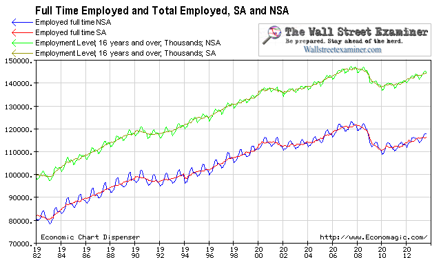
The number of persons employed full time in April rose by just 83,000, not seasonally manipulated (from the household survey). That compares with a gain of 658,000 in April 2011. It’s the worst April performance since 2007. The average gain in April for the previous 10 years was 653,000. I suspected that this was partly a giveback due to the unusually warm weather boosting the number in March. The March gain of 1.33 million was a record since 2002, and it was multiples of the typical March gain of 289,000. Looking at the 3 months from January to April this year’s gain of 1.47 million wasn’t as strong as 2011′s gain of 2.6 million but was well above the prior 10 year average of 1.11 million.
The chart above gives some perspective on how far total employment fell in the first stage of this depression, and how much they have yet to recover. Full time employment is lagging.
Over the previous 10 years, the level of full time employment in April has been, on average 2.8 million below the previous year’s July level which is usual the high for the year. Last year the April number was 2.1 million less than July 2010. This year the April level is already ahead of the level of last July by 240,000. This report is not the disaster that the pundits, the media, and especially the trading bot Al Gore rhythms seem to believe.
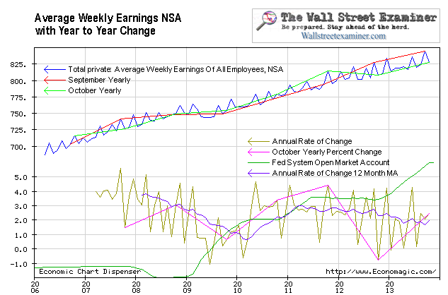
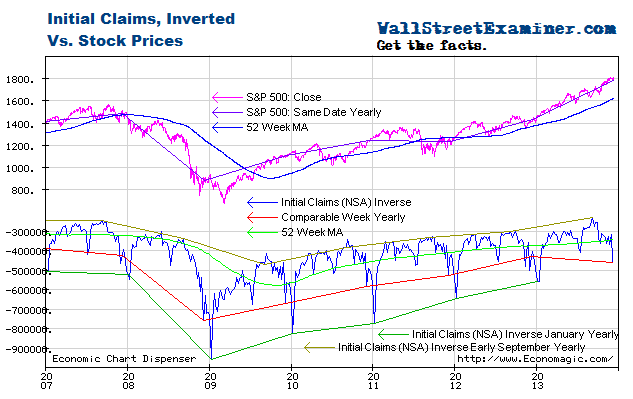
Stock market performance is at the mercy of the Fed (0r over the past 12 months the ECB, not shown), and employment follows them both. While at times there’s a lag, the linkage is undeniable. The SOMA lately does not reflect the impact of the Fed’s MBS purchases from the Primary Dealers, a subject which is covered in depth weekly in the Fed Reports. That graph has been rising steadily since last September and stocks and full time employment have followed.
But all is not rosy. In a stat that virtually no one pays any attention to, average weekly earnings for all private sector employees have risen by 3.6% over the past 12 months. While the wages of hourly workers were previously stagnating, even they have been rising lately, with the average hourly wage now up 2.7% in the last 12 months. The change for the past 2 years had been barely 2% per year. With total weekly earnings up by 3.7%, it’s clear that non-hourly employees are doing even better. Those executive salaries are really skewing things.
Average Weekly Earnings
This brings me back to one of my favorite crying points in the weekly Fed Reports. Dr. Bernankenstein’s inflation target is 2%. Because he and the FOMC only look at the lagged and artificially suppressed core PCE measure, which ignores all the prices that are rising, he thinks that inflation is still below the target. The Fed is so far behind the curve that the train has already left the station and they’re standing on the platform looking the other way waiting for it to arrive.
Initial Claims Charts
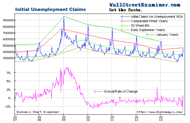
Actual, not seasonally manipulated, weekly initial unemployment claims, while volatile week to week, have continued to decrease at a relatively constant rate over time since mid 2010.
Plotted on an inverse scale, the correlation with stock prices is strong. Both are driven by the Fed’s operations with Primary Dealers as covered weekly in the Professional Edition Fed Report.
As the number of workers eligible for unemployment compensation has trended upward slightly since 2009, the percentage of workers filing first time claims has continued to decline.
Federal Withholding Taxes
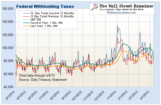
This chart compares current withholding tax collections with last year on the same date. This year has been running ahead of last year in nominal terms.
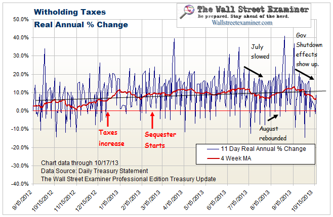
This chart looks at the year to year change in withholding in real terms, adjusted by the average weekly wage data from the BLS. On this score, following a bulge in March that was probably due to mutual fund withholding for capital gains distributions, the comparison is back to flat which does not bode well for employment. These 2 charts are updated and analyzed weekly in the Professional Edition Treasury update in conjunction with their implications for employment, and in particular the Federal deficit and Treasury supply.
This page is updated regularly and can be found in the Learn More menu in the left sidebar under Economic Charts- Employment Charts. Please bookmark that page for your convenient future reference.
Follow my comments on the markets and economy in real time @Lee_Adler on Twitter!
Stay up to date with the machinations of the Fed, Treasury, Primary Dealers and foreign central banks in the US market, along with regular updates of the US housing market, in the Fed Report in the Professional Edition, Money Liquidity, and Real Estate Package. Try it risk free for 30 days. Don’t miss another day. Get the research and analysis you need to understand these critical forces. Be prepared. Stay ahead of the herd. Click this link and begin your risk free trial NOW!
Get regular updates the machinations of the Fed, Treasury, Primary Dealers and foreign central banks in the US market, in the Fed Report in the Professional Edition, Money Liquidity, and Real Estate Package. Click this link to try WSE’s Professional Edition risk free for 30 days!
Copyright © 2012 The Wall Street Examiner. All Rights Reserved. The above may be reposted with attribution and a prominent link to the Wall Street Examiner.


