

The trend of lower Covid-19 case numbers per capita in blue states compared to red states isn't itself surprising, but the magnitude of the differences may be. You can visualize the evolving differences in case loads by watching the infection's progression, as measured by cases per capita, at Dan's website.
[Visit Dan’s COVID Charts to see these amazing animated charts and more. Fortunately, Dan broke his Twitter hiatus to share his work.]
People say I should break my 12-year Twitter hiatus to share my latest animated COVID chart. It compares state cases factoring in partisanship since June 1, when science had proven methodology as to how to stop the spread after the initial sucker punch. https://t.co/FvifckA30f
— dangoodspeed (@dangoodspeed) October 13, 2020
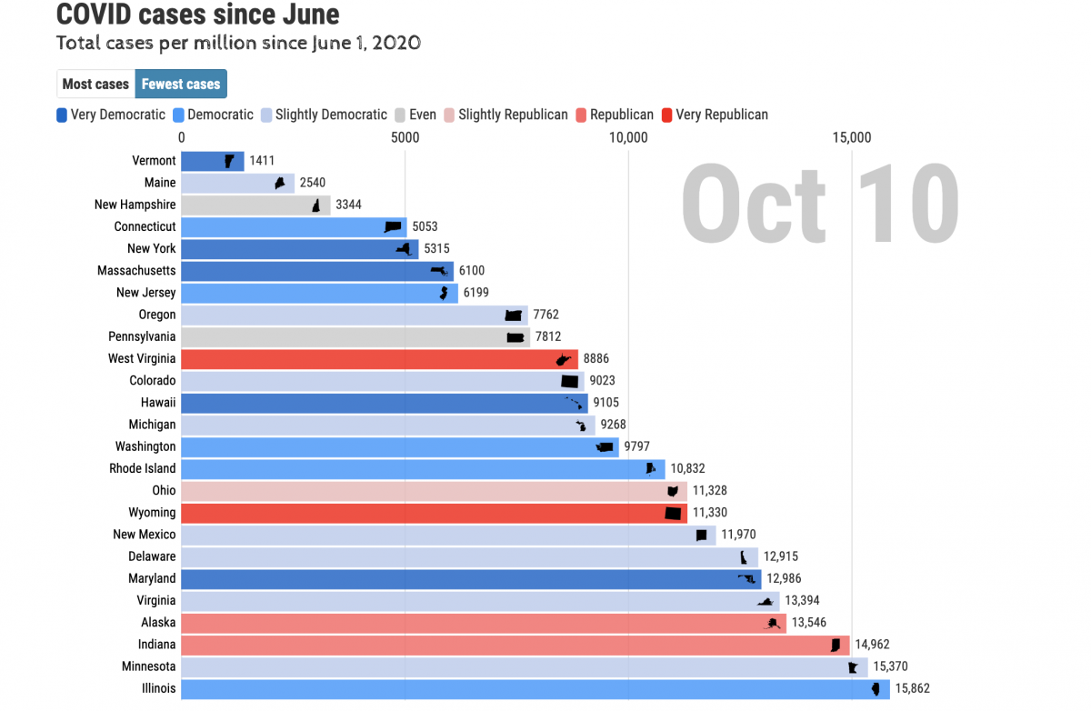
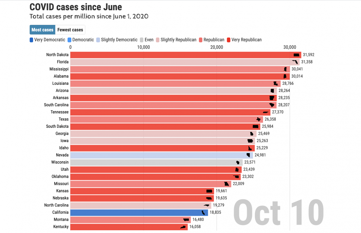
Screenshot of the charts showing the states which have fared the best and the states that have fared the worst as of October 10, 2020 — as you can see, the blue states are highly clustered among the 25 best states (fewest cases per capita) and the red states are clustered among the 25 worst states (most cases):
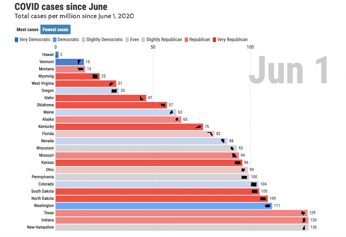
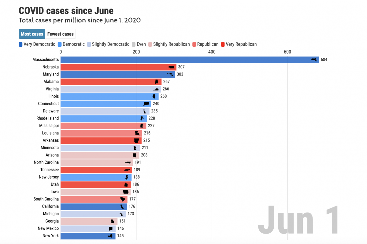
On June 1, 20, the situation was quite different — the pattern, resulting from how the states handled the pandemic, had not yet evolved. Here are the "before" pictures:
Thanks, Dan!
Follow Dan on Twitter here.