

The market doesn’t care about the news; it cares about how that news compares to what the big money already expected. If you’re still trying to click “buy” the millisecond a CPI report hits the tape, you aren’t trading; you’re just paying a “volatility tax” to the institutions. Mastering economic data analysis for traders in 2026 isn’t about being the fastest to read a headline. It’s about understanding why the market might rally on a 1.5% GDP print that looks “bad” on paper or why a 3.4% inflation rate is already old news to the people moving the real money.
It’s exhausting to feel like you’re constantly on the wrong side of the “news trade,” getting stopped out by spikes that make no sense. We’ve all been there, staring at the screen in disbelief as the Fed’s 3.63% effective rate sends the indices in a direction that defies logic. This guide is your filter. You’ll learn a repeatable framework to decode the macro narrative, predict how the Fed will actually react to specific reports, and time your options entries like a professional. We’re moving past the retail noise to build a strategy that treats the economic calendar as a tool for risk management, not a gambling floor.
Key Takeaways
- Stop falling for the “Actual vs. Forecast” trap and learn how the house synthesizes macro reports to identify major market regime shifts.
- Navigate the trader’s hierarchy by separating high-impact “Tier 1” indicators from the statistical noise that distracts retail gamblers.
- Decode the Fed’s dual mandate to anticipate hawkish or dovish pivots before they are fully priced into the market.
- Implement a professional framework for economic data analysis for traders to better time options entries and hedge against news-driven volatility.
- Shift from reacting to automated news bots to following a unified macro worldview that transforms raw global data into actionable trade ideas.
The Signal vs. The Noise: Why Retail Traders Fail at Economic Data Analysis
Effective economic data analysis for traders isn’t about memorizing a calendar or having the fastest trigger finger. It’s the sophisticated synthesis of macro reports to forecast market regime shifts. Most retail players treat a headline like a sports score. The market isn’t a scoreboard; it’s a discounting mechanism. By the time you read that a report was “better than expected,” the institutional desks have already priced in the next three months of policy. Trading the news is gambling. Analyzing the data is investing.
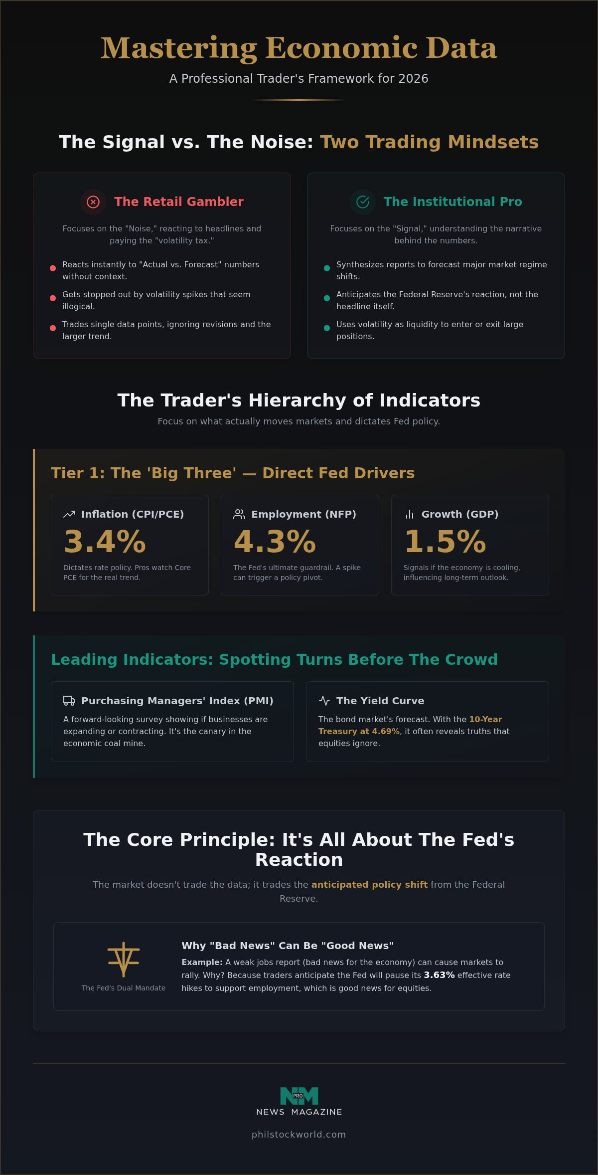
The “Actual vs. Forecast” trap is where most accounts go to die. You’ve seen it happen: the unemployment rate ticks up, and the market suddenly rallies 2%. Why? Because the market didn’t care about the jobs. It cared about the Federal Reserve’s potential reaction to those jobs. If the data suggests the Fed might pause its 3.63% effective rate hikes, “bad” news becomes “good” news for equities. Without a bird’s-eye view, you’re just reacting to shadows on a wall.
The Illusion of Certainty in Government Reports
Government data is a lagging rearview mirror. Every economic indicator released by the Bureau of Labor Statistics or the Commerce Department is subject to “seasonal adjustments” that smooth out the messy reality of the street. These are often little more than statistical guesses. The market cares about the long-term trend, not a single, noisy data point from a Tuesday morning. Data revision is the silent killer of retail news-trading accounts. You might trade on a headline today only to find out three weeks later that the number was revised by 40%, making your original entry point completely irrelevant.
The ‘House’ Perspective: How Institutions Use Your Reaction
The “house” doesn’t trade the news; they trade the people who trade the news. High-impact releases create massive spikes in volume. This provides the liquidity big institutions need to enter or exit large positions without moving the price against themselves. While you’re panicking because of a headline, the pros are using your emotional reaction to fill their orders. At Phil Stock World, we prioritize context over raw speed. We aren’t trying to beat a high-frequency trading bot to the punch. Instead, we use economic data analysis for traders to identify where the big money is leaning. This allows us to sell premium and hedge when the retail crowd is most certain of a direction that doesn’t actually exist.
The Trader’s Hierarchy: Which Economic Indicators Actually Move Markets?
If you try to track every data point on the global calendar, you’ll end up with a headache and a blown account. The secret to professional economic data analysis for traders is knowing what to ignore. Most financial sites brag about tracking millions of indicators. We think that’s a recipe for paralysis. In 2026, the market only has eyes for a handful of reports that actually shift the needle. We call this the Trader’s Hierarchy. It separates the market-moving signals from the statistical fluff that retail gamblers obsess over.
Tier 1: The ‘Big Three’ for 2026 Traders
Inflation and employment are the only games in town right now. With the Consumer Price Index (CPI) hitting 3.4% through July 2026, every decimal point dictates whether the Fed keeps the effective funds rate at 3.63% or starts to lean harder into a hike. While the retail crowd stares at the headlines, the pros are digging into the Core PCE numbers to find the real trend. Similarly, the Non-Farm Payrolls (NFP) report remains the Fed’s ultimate guardrail. With unemployment expected to average 4.3% this year, any sudden spike in joblessness could trigger a rapid policy pivot. Finally, keep an eye on GDP. The U.S. Bureau of Economic Analysis (BEA) reported a slowdown to 1.5% growth in Q2 2026, signaling that the investment-led boom might be cooling faster than anticipated.
Leading Indicators: Spotting the Turn Before the Crowd
While GDP tells you where we were, leading indicators tell you where we’re going. The Purchasing Managers’ Index (PMI) is the canary in the coal mine. It shows whether business leaders are actually spending money on productivity-enhancing tech or pulling back. We also watch the Yield Curve with a hawk’s eye. With the 10-year Treasury sitting near 4.69%, the bond market is giving us a brutally honest forecast that often contradicts the rosy narratives on cable news. Consumer Sentiment is another heavy hitter; how people feel today predicts where they’ll spend tomorrow. “The House” doesn’t wait for the official recession call. We use these leading signals to position our hedges before the crowd even realizes the wind has shifted.
Building your own calendar means cutting the fluff. You don’t need to know the housing starts in every corner of the globe to trade the SPY effectively. You need a filter that highlights the market shifters and mutes the noise. Our market charts and analysis help members focus on these high-impact events so they can stop reacting and start anticipating the next big move.
Decoding the Fed: Translating Economic Data into Monetary Policy
The Federal Reserve is the biggest player in the room. If you want to master economic data analysis for traders, you have to stop looking at the Fed as a neutral observer. They are active participants who use a “Dual Mandate”, balancing price stability with maximum employment, to decide when to squeeze the market and when to let it breathe. In 2026, this balance is precarious. With inflation at 3.4% and GDP growth stumbling at 1.5%, the Fed is caught between a rock and a hard place. They can’t cut rates to save growth without risking an inflation flare-up, but they can’t hike much further without breaking the back of the consumer.
Reading FOMC minutes isn’t about looking for “good” or “bad” news. It’s about spotting the shift from hawkish to dovish language. Professional traders look for the “reaction function.” This is the set of conditions that would force the Fed to change course. Most retail gamblers wait for the rate decision itself. The house, however, watches “Fedspeak”, the speeches and interviews given by governors between meetings. These are often used to leak policy shifts to the market slowly, preventing a violent shock. What they say about the data often matters much more than the data itself.
The Fed’s Reaction Function: A Trader’s Map
Stagflation is the nightmare scenario for 2026. If growth stays low while prices stay high, the Fed’s map becomes a maze. We use tools like Federal Reserve Economic Data (FRED) to track the velocity of money and labor participation rates in real-time. This helps us see the pivot before it hits the headlines. The Fed doesn’t trade the data; they trade the expectation of the data. By the time a report is public, the 3.63% effective funds rate has already been factored into the bond market’s 4.69% yield on the 10-year Treasury.
Quantitative Tightening (QT) and Liquidity Cycles
The Fed’s balance sheet is the hidden hand behind stock market multiples. Quantitative Tightening (QT) sucks liquidity out of the system, making it harder for stocks to maintain high valuations. The “Fed Put”, the idea that the central bank will always bail out the market, is looking thin in 2026. Without the safety net of zero-interest rates, you need a more sophisticated approach than just buying the dip. To survive this environment, you have to understand how to use these macro shifts to inform your trades. For a deeper dive into protecting your capital, check out our guide on Mastering Advanced Option Trading Strategies to learn how to trade like the house when the Fed stops playing nice.
Actionable Strategy: Integrating Data Analysis into Your Options Playbook
Knowing the data is only half the battle. The other half is knowing how to bet on it without getting your head handed to you. Professional economic data analysis for traders requires a shift from “What will the number be?” to “What is the market expecting, and how do I profit if they’re wrong?” You aren’t trying to be an economist. You’re trying to be a bookie. By following a structured playbook, you can move away from directional gambling and toward a more calculated “house” approach.
Your weekly routine should follow these five steps:
- Step 1: Identify High-Impact Events. Check the calendar for the heavy hitters like CPI or NFP. If it isn’t a market shifter, ignore it.
- Step 2: Assess Sentiment. Look at the 10-year Treasury, currently near 4.69%, to see what the bond market thinks. Is a 3.4% inflation print already priced in?
- Step 3: Determine Risk/Reward. Decide if you’re betting on a massive move or if the market is overestimating the reaction.
- Step 4: Execute Defined-Risk Trades. Use spreads or butterflies. Never go “naked” into a news event.
- Step 5: Post-Event Review. Did the 1.5% GDP growth change your long-term thesis, or was the intraday drop just a liquidity trap?
Selling the ‘Vol’ Around Data Releases
Retail traders love to buy calls or puts right before a big announcement. They’re paying a massive premium because implied volatility (IV) is at its peak. As soon as the news hits the tape, that volatility collapses. This is the “IV crush,” and it’s why your options can lose value even if the price moves in your direction. To trade like the house, you want to be the one selling that overpriced premium to the gamblers. Strategies like Iron Condors allow you to profit as long as the market stays within a specific range, letting the post-news calm put money in your pocket. It’s about using economic data analysis for traders to identify when the crowd is overreacting to potential “shocks.”
Hedging Your Long-Term Portfolio
Data releases often create short-term “dips” that are perfect for layering in protective puts. If the macro narrative is shifting toward stagflation, you don’t just sell everything. You hedge. This allows you to stay in your long-term winners while protecting your downside. Sometimes, the best data-driven trade is sitting on your hands. Cash is a strategic position, especially when the yield curve is screaming for caution. If you’re tired of guessing which way the wind blows, our Phil Stock World Membership provides real-time hedging alerts that turn raw data into a concrete defense for your portfolio.
Ready to see if your current approach holds up? Get a Virtual Portfolio Review to align your holdings with the 2026 macro reality.
Beyond the Headlines: Filtering the Noise with Phil Stock World
The world is drowning in data. In 2026, you can access millions of indicators from nearly every country on earth with a single click. But data without interpretation is just noise. Most retail traders are trying to outrun automated news bots that can process a GDP report in microseconds. You can’t beat the bots at speed. You beat them at context. This is where sophisticated economic data analysis for traders moves from a spreadsheet to a strategy. Having a savvy mentor who has navigated market cycles since 2006 makes the difference between a panicked reaction and a calculated trade.
Phil Stock World provides a unified worldview that synthesizes global events into actionable ideas. We don’t just report that Q2 2026 GDP growth slowed to 1.5%. We discuss what that means for the Fed’s next move and how it impacts our existing hedges. Our daily commentary cuts through the dry, institutional formality of the financial sector. It feels less like a lecture and more like a high-level discussion among peers who are actually putting money to work. It’s about finding the signal in a sea of static.
The Phil Stock World Edge: Wit, Wisdom, and Winning
Skepticism is your greatest asset in this market. The mainstream narrative often ignores the quiet revisions that render initial headlines meaningless. We look at the “why” behind the numbers. If you’re wondering if your own data analysis is actually translating to P&L, it might be time for a Virtual Portfolio Review. It’s a reality check to ensure your holdings align with the macro shifts we’re seeing in this high-interest-rate environment. We help you move past the “hope” phase of trading and into a disciplined, data-driven approach.
Joining the Inside Club
Our Live Trading Room isn’t a place for passive observation. It’s a real-time, interactive environment where we apply economic data analysis for traders to live options plays. We focus on position sizing and selling premium rather than chasing the “hot” stock of the day. A disciplined community is the best defense against the FOMO that high-volatility news releases trigger. You aren’t just getting data; you’re getting a repeatable framework for how to trade like the house. Stop being the liquidity for the institutions. Join our community and gain access to the market charts and analysis that turn macro noise into actionable opportunity. Start your journey toward becoming the house today.
Mastering the Macro Game in 2026
The economic landscape of 2026 doesn’t reward the fastest clickers; it rewards the most disciplined thinkers. We’ve explored how to separate the signal from the noise, prioritizing high-impact indicators like inflation and employment over the statistical fluff that distracts the retail crowd. By decoding the Fed’s reaction function and understanding the shift toward investment-led growth, you can stop reacting to headlines and start anticipating market regime shifts. Effective economic data analysis for traders is about more than just reading a calendar. It’s about having a repeatable framework that turns macro volatility into a strategic advantage.
You don’t have to navigate these choppy waters alone. With real-time trade alerts based on deep macro synthesis and access to our live Options Trading Room, you can move past the media hype and focus on what actually moves the needle. Our expert commentary provides the skeptical, street-smart perspective you need to protect your capital and find opportunity in any environment. Join Phil Stock World and start trading like ‘the house’ today! The market is moving fast, but with the right mentors, you’ll always stay one step ahead.
Frequently Asked Questions
What is the most important economic indicator for day traders?
The Consumer Price Index (CPI) and Non-Farm Payrolls (NFP) are the undisputed heavyweights because they directly influence the Federal Reserve’s interest rate decisions. Day traders need to watch these reports because they create the most immediate liquidity and volatility. If you are performing economic data analysis for traders, you’ll notice that these two reports often set the tone for the entire month’s trading range.
How can I tell if an economic report is already ‘priced in’?
You can gauge if a report is priced in by watching the reaction of the bond market before the release. If the 10-year Treasury yield has already moved significantly in anticipation, the surprise factor is often gone. When the news hits and the price barely flinches, the market has already digested the information. The house looks for these moments to sell premium to latecomers who are chasing the headline.
Why does the stock market go up when economic data is bad?
This happens because the market is a forward-looking discounting mechanism. Bad data often suggests that the economy is cooling enough for the Federal Reserve to pause or lower interest rates. Investors value future earnings more highly when rates are lower, so bad news for the economy can be good news for stock valuations. It is all about the Fed’s potential reaction to the data.
How do I trade the Non-Farm Payrolls (NFP) report without gambling?
Avoid the initial five-minute whipsaw where price moves violently in both directions. Instead, wait for the market to establish a clear trend after the first hour of trading. Using defined-risk strategies like vertical spreads allows you to participate in the move without risking a total loss if the data is revised or the market reverses. Don’t be the liquidity for the big institutional banks.
What is the difference between a leading and a lagging economic indicator?
Leading indicators like the Purchasing Managers’ Index (PMI) act as a canary in the coal mine by showing where business leaders are spending money now. Lagging indicators like GDP or the unemployment rate confirm what has already happened over the previous quarter. The house uses leading indicators to position for turns before they become obvious to the retail crowd. Confirmed data is for the history books.
Is it better to trade before or after an economic data release?
It’s almost always better to trade after the release. Entering before the news is a coin flip because you are fighting against peak implied volatility. Once the data is out, the volatility crush happens, and you can enter a trade with a much clearer understanding of the market’s reaction. Let the gamblers take the initial hit while you wait for a high-probability setup to emerge.
How does the Federal Reserve use CPI data to set interest rates?
The Fed uses CPI to measure its progress toward its price stability target. If the index remains stubbornly high, the central bank is forced to keep interest rates elevated to reduce consumer demand. Professional economic data analysis for traders involves watching the core numbers, which strip out volatile food and energy costs, as these are the figures that the Fed uses to justify its policy shifts.
Can economic data analysis help with long-term options strategies?
Absolutely. Understanding the macro narrative helps you decide when to buy long-term protective puts or when to sell covered calls. If the data suggests we are entering a period of slowing growth, you can adjust your LEAPS or long-term hedges to protect your portfolio. Macro data provides the weather report that tells you whether to pack an umbrella or a swimsuit for your long-term positions.