


The market isn’t a random number generator. It is actually a high-stakes psychological map, a living record of every fear, hope, and mistake made by millions of traders simultaneously. If you feel like the system is rigged against you, you’re right in one sense: the pros aren’t looking at the same things you are. Learning how to read market charts isn’t about memorizing fifty different squiggly lines or chasing every “hot” indicator that pops up on your feed. It’s about learning to spot the footprints of the herd before they trample your portfolio.
It is exhausting to feel constantly “faked out” by a breakout that turns into a breakdown the second you enter a trade. We’ve all been there, drowning in information overload while the big players seem to move with effortless precision. This guide will help you master the art of technical analysis so you can finally stop guessing and start identifying high-probability setups with the confidence of “The House.” We will break down the essential framework for spotting support, resistance, and the subtle shifts where “smart money” is actually moving, giving you a clear lens to view the volatility of the 2026 market.
Key Takeaways
- Learn how to read market charts by treating price action as a psychological map of the herd, moving beyond simple lines to understand the collective fear and greed driving every move.
- Decode the anatomy of candlesticks to distinguish between high-conviction momentum and the “snap-back” rejections that often trap retail traders in false breakouts.
- Identify major support and resistance zones to locate the specific “battlegrounds” where the smart money is most likely to step in and defend a position.
- Discover why technical patterns never exist in a vacuum and how to account for macroeconomic events that can override even the most perfect chart setup.
- Master a structured framework for identifying primary trends on higher timeframes, ensuring your trade decisions are always aligned with the path of least resistance.
What is a Market Chart? Decoding the Footprints of the Herd
A market chart is a visual narrative of every buy and sell decision made by market participants. It isn’t just data; it is a window into the collective soul of the market. When you learn how to read market charts, you aren’t looking for a crystal ball. You’re looking for the footprints of the herd. Every spike in price is a surge of greed; every crash is a wave of panic. Professional traders don’t get swept up in these emotions. Instead, they use charts to identify where “The House” is likely to step in and stabilize the chaos. Mastering how to read market charts effectively requires you to look past the flashing lights and focus on the structural reality of the price action.
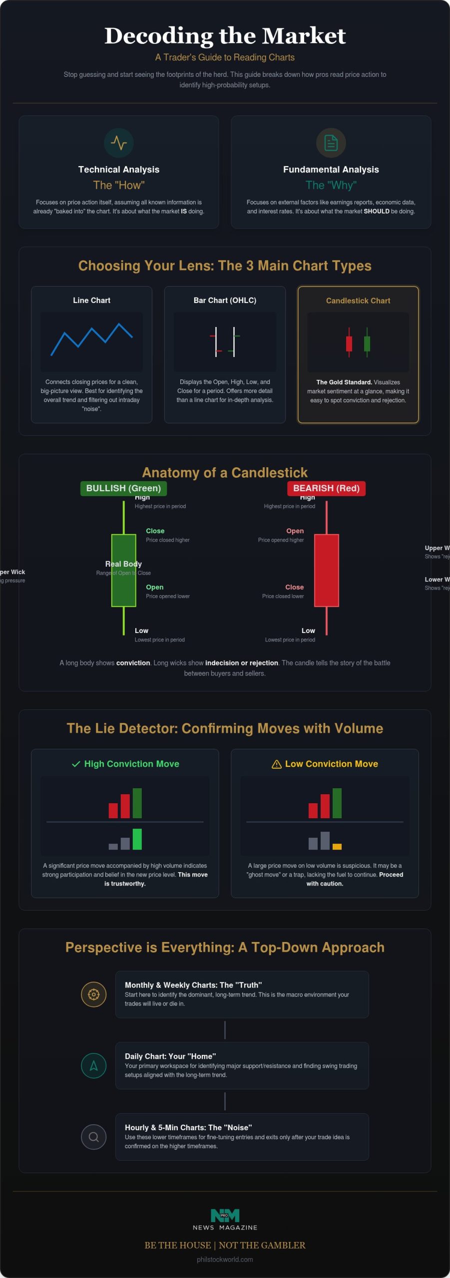
Think of technical analysis as the “how” of the market. While fundamental analysis focuses on the “why,” such as earnings reports or interest rate shifts, technical analysis focuses on the price action itself. It assumes that all known information is already baked into the price. By watching the tape, you can see what the market is actually doing, rather than what it should be doing. This perspective is vital in a 2026 environment where high-speed shifts in sentiment can render traditional valuation models obsolete in minutes.
The Three Main Chart Types: Line, Bar, and Candlestick
Every trader has a preferred lens, but they aren’t created equal. Line charts offer the cleanest “big picture” view, connecting closing prices to show the overall trend without the intraday static. Bar charts add more detail, displaying the open, high, low, and close (OHLC) for a specific period. However, the Candlestick chart remains the gold standard for modern traders. These charts use color-coded bodies and shadows to visualize sentiment at a glance. They make it much easier to spot where the herd got rejected and where the smart money took control of the session.
Timeframes: From Day Trading to Long-Term Investing
Perspective is everything. A 5-minute chart is often full of “noise,” showing erratic movements that don’t reflect the true direction of the asset. Conversely, the weekly chart represents the “truth,” filtering out the daily drama to reveal the dominant trend. We always recommend a “Top-Down” approach. Check the monthly and weekly charts to understand the broader environment before you ever think about placing a trade on the daily or hourly view. Matching your timeframe to your specific goals is the only way to avoid getting chopped up by short-term volatility. If you’re swing trading, the daily chart is your home, but the weekly chart is your compass.
The Anatomy of a Candlestick: Reading the Price Action
If a line chart is a simple summary, a candlestick is a full transcript of the market’s internal conflict. It tells you exactly who was in control, when they lost their nerve, and where the power shifted. Understanding this anatomy is the first real step in mastering how to read market charts because it transforms flat data into a vivid story of human emotion. Each candle represents a specific period, whether it’s five minutes or a full week, and it captures the four critical data points: the open, high, low, and close.
The real body is the solid part of the candle, representing the price range between the open and the close. A long, thick body shows conviction. It means one side took the wheel and drove the price decisively in their direction. Wicks, or shadows, tell a different story. These are the thin lines poking out of the top and bottom. They represent the “failed” prices. A long upper wick shows that the herd tried to push the price higher, but they were met with a wall of professional selling that slammed the door shut. It is a visual record of rejection.
Color coding provides instant visual shorthand for this sentiment. Green usually means the bulls won the round, while red means the bears took the trophy. However, savvy traders know that color can be deceptive. This is why we look at volume, the ultimate lie detector of the chart. If a price moves significantly but the volume is low, the move lacks conviction. It is a ghost move. Volume is the fuel that drives the engine of price movement. Without high volume, even the most impressive candle is likely just noise.
Common Candlestick Patterns You Need to Know
Some patterns act as early warning systems for a shift in the herd’s mood. A Doji occurs when the open and close are nearly identical, resulting in a candle that looks like a cross. This is a sign of pure indecision; the market is holding its breath and waiting for a catalyst. Then you have the Hammer, a bullish reversal signal where a long lower wick shows buyers stepped in to rescue the price after a deep dive. Conversely, an Engulfing pattern happens when one candle completely swallows the previous one, signaling a total takeover by the opposite side. To see these patterns identified in real-time, you might find our Market Charts and Analysis a valuable resource for your daily routine.
Why Volume is the Ultimate Truth-Teller
A price breakout on low volume is often a “fake-out” waiting to happen. It’s usually the retail herd chasing a headline while the big players sit on their hands. When you see massive volume at established support levels, it often indicates that “The House” is quietly buying the dip and absorbing the selling pressure. If the price is moving but the volume isn’t following, the move isn’t real. Always look for volume to confirm that there is actual money, not just emotion, behind the price action you see on the screen.
Identifying Trends, Support, and Resistance
Once you understand the individual candles, you need to see how they form a larger map. Support and resistance levels are the most critical features on that map. Think of support as a psychological floor where buyers consistently step in to stop a decline. It is the point where the herd decides an asset is finally “cheap” enough to own. Resistance is the opposite; it is a ceiling where sellers prevent the price from rising further because they believe it’s time to take their chips off the table. These aren’t just lines on a screen. They are the scars of previous battles between buyers and sellers.
Drawing trendlines correctly is a skill that separates the pros from the amateurs. You don’t just connect any two random points. A valid trendline requires at least three distinct touches to be considered reliable. Two points are just a coincidence; three points are a trend. The old saying that “the trend is your friend” is popular for a reason, but the savvy trader adds a caveat: it’s only your friend until it ends. Learning how to read market charts effectively means knowing when a trend is losing steam before the rest of the crowd realizes the music has stopped. For a deeper look at how to get ahead of these shifts, our guide on identifying market trends before the herd catches on provides a powerful complement to these chart-reading fundamentals.
Spotting Market Cycles: Bullish, Bearish, and Sideways
Markets move in distinct cycles. A bull market is defined by a series of higher highs and higher lows, showing a clear path of upward momentum. A bear market does the reverse, carving out lower highs and lower lows as sentiment sours. However, the most dangerous environment for retail traders is consolidation. This sideways movement is a meat grinder. It’s where the market lacks a clear direction and “fake-outs” are common. If you can’t identify a clear trend, often the best trade is no trade at all. Staying patient during these periods is what separates the veterans from the gamblers.
The Role of Moving Averages
Moving averages are essential tools for smoothing out the daily noise. The 50-day and 200-day moving averages are institutional battlegrounds. When price approaches these levels, big players are watching closely to see if the trend will hold or break. We often use these levels to set up advanced option trading strategies like credit spreads, allowing us to trade with the statistical advantage of “The House.” By focusing on these smoothed lines, you can ignore the frantic 5-minute spikes and focus on the structural truth of the market. It’s about seeing the signal through the static.
Beyond the Pattern: Why Sentiment and Macro Matter
A beautiful chart pattern is a great start, but it isn’t a guarantee. Charts don’t exist in a vacuum. They are constantly reacting to the “Daily Pulse” of global events. You might find a perfect bull flag, but if the Federal Reserve announces a surprise rate hike or a tech giant misses earnings by a mile, that technical setup will evaporate instantly. Truly mastering how to read market charts involves understanding the context surrounding the lines. If you aren’t checking the economic calendar, you’re essentially flying blind into a storm.
Market sentiment is the invisible force that moves the needle. Indicators like the Relative Strength Index (RSI) are helpful, but they shouldn’t be treated as magic formulas. Use the RSI to gauge if the herd has become too greedy or too fearful. When the RSI pushes above 70, the market is often overextended and ripe for a pullback. Conversely, always check if the broad market, like the S&P 500, supports your individual stock. If the S&P is sliding, even the best-looking individual chart is likely to get dragged down with it. In July 2026, for example, the VIX sat at 17.3, suggesting a market that had absorbed significant uncertainty but remained sensitive to sudden shifts.
The Trap of “Indicator Overload”
Analysis paralysis is a real threat to your P&L. If you have ten different indicators cluttering your screen, you’ll never get a clear signal. One will say buy, another will say sell, and you’ll end up doing nothing. Our approach is simple: price and volume are the primary signals. Everything else is secondary. By keeping your charts clean, you maintain a savvy, street-smart edge that allows you to see what is actually happening. Many traders who fall into this trap are also relying on paid stock picking services that flood their screens with conflicting alerts instead of teaching them to read the tape themselves. If you want to refine this skill, consider a Virtual Portfolio Review to see if your current setup is actually working for you.
Macro Market Insights
Macroeconomics provides the wind at your back. Interest rates and inflation data are the primary drivers of long-term trends. In 2026, the shift toward a more deregulatory SEC environment and the elimination of the Pattern Day Trader rule have fundamentally changed how retail participants approach risk. Recognizing when a chart is “fighting the tape,” or moving against the macro trend, can save you from a lot of unnecessary losses. For a deeper dive into how these global forces impact your daily trades, the Phil Stock World membership provides the daily macro context you need to stay ahead of the curve.
Putting Chart Reading into Practice: The PSW Strategy
Theory is fine, but the bank account only grows when you put these concepts into motion. To truly master how to read market charts, you need a repeatable process that filters out the noise and focuses on high-probability setups. We don’t chase every green candle. We wait for the market to come to us at specific price points where the odds are stacked in our favor. This is the “House” mentality in action. It requires patience, discipline, and a refusal to get swept up in the frantic energy of the retail herd.
The first step is always identifying the primary trend on the daily and weekly charts. If the weekly trend is bearish, buying a daily “bounce” is a low-probability gamble. Once the trend is clear, you must locate the major support and resistance zones, which we call the battlegrounds. These are the levels where the heavy hitters are waiting to make their move. Step three involves looking for candlestick confirmation at these zones. We want to see a hammer or an engulfing candle that proves the power is shifting. Finally, we check volume and macro sentiment to confirm the move. If all the lights are green, we define our risk-reward ratio before clicking “buy.”
Risk Management: The Difference Between Trading and Gambling
Position sizing is far more important than being “right” about a specific chart. Even a perfect chart pattern only has a statistical edge, not a guarantee. If you bet too much on one “sure thing,” a single failed breakout can wipe out weeks of progress. We use stop-losses to protect our capital from these failed patterns. It’s about staying in the game long enough for your edge to play out over hundreds of trades. Trading without a stop-loss isn’t investing; it is gambling with your eyes closed while hoping the market stays rational.
The Power of Live Trading Sessions
Static charts are useful for homework, but real-time analysis is where the real learning happens. Seeing a professional read a chart in a live trading room accelerates your progress because you see the decision-making process as it unfolds. You learn to handle the uncertainty and the rapid shifts in sentiment that a textbook simply can’t capture. Participating in interactive trading sessions allows you to trade alongside seasoned mentors who can transform overwhelming noise into actionable profit strategies in real time. If you want to see how your own chart-reading skills measure up, we encourage a virtual portfolio review to audit your current strategy against these house principles. It is the best way to ensure your technical analysis is actually translating into consistent, actionable results.
Trading with the Confidence of the House
You’ve moved beyond the basic lines and squiggles to understand the deep psychological undercurrents of the market. Mastering how to read market charts is about more than just spotting a pattern; it’s about recognizing the structural reality of where the herd is trapped and where the smart money is positioning itself. By combining candlestick confirmation with volume analysis and macro sentiment, you’ve built a framework that prioritizes clarity over confusion. This isn’t just about technicals; it’s about developing the street-smart intuition to know when the tape is lying to you.
Since 2006, we’ve provided daily market commentary and a savvy “House” perspective on options that cuts through the institutional noise. Reading a static chart is helpful, but seeing the action unfold in real-time is how you truly sharpen your edge. Join the Phil Stock World Live Trading Room and see how we read the charts in real-time to experience our interactive sessions and see these principles applied to the 2026 market. It’s time to stop guessing and start trading with the calm confidence of a professional. You’ve got the tools; now it’s time to put them to work.
Frequently Asked Questions
Is technical analysis more reliable than fundamental analysis?
Technical analysis focuses on price action and timing, while fundamental analysis looks at the intrinsic value of an asset. One isn’t necessarily more reliable than the other, but they provide different types of conviction. Technicals tell you the “how” and “when” of a trade, reflecting the current mood of the herd. Fundamentals explain the “why.” Most successful traders use a combination of both to ensure they aren’t fighting the tape during a major earnings shift.
Which timeframe is best for reading market charts?
The best timeframe depends entirely on your specific trading goals and available time. If you’re swing trading, the daily chart is your primary home, but you should always consult the weekly chart for the broader trend. Short-term timeframes like the 5-minute chart are often filled with erratic noise that can lead to overtrading. Higher timeframes generally provide more “truth” and reliable signals for those learning how to read market charts without getting chopped up.
What is the most accurate candlestick pattern for beginners?
The Hammer and the Engulfing pattern are often considered the most reliable for beginners because they show a clear shift in power. A Hammer indicates that buyers stepped in aggressively after a price drop, while an Engulfing candle shows one side of the market completely overwhelming the other. These patterns are most effective when they appear at established support or resistance levels. They provide a high-conviction signal that the previous trend may be exhausted.
How much money do I need to start trading based on charts?
You can start with as little as a few hundred dollars, especially since the FINRA Rule 4210 amendment in June 2026 eliminated the $25,000 minimum equity requirement for many traders. This change removed the old “Pattern Day Trader” designation, making the markets more accessible to retail participants. However, you should only trade with capital you can afford to lose. Proper position sizing is more important for long-term survival than the initial size of your bankroll.
Can I use market charts for options trading?
Charts are absolutely essential for options trading because they help you identify the best levels to sell premium or buy directional plays. We use technical analysis to set up credit spreads at institutional battlegrounds, like the 200-day moving average. Understanding support and resistance allows you to choose strike prices with a higher statistical probability of expiring out of the money. Technicals provide the map, while options provide the leverage to trade like the house.
What happens if a chart pattern fails?
If a chart pattern fails, you must exit the trade immediately using a pre-determined stop-loss. No pattern offers a 100% guarantee; they only provide a statistical edge over a large sample of trades. A “failed” breakout is actually a signal in itself, often indicating that the herd is trapped and a sharp move in the opposite direction is coming. Protecting your capital is the only way to stay in the game when the market behaves irrationally.
Do professional traders really use simple trendlines?
Professional traders absolutely use simple trendlines because they know that thousands of other participants are looking at the exact same levels. When a trendline is clear and has multiple touches, it becomes a self-fulfilling prophecy. Institutions often place large orders near these obvious structural points. You don’t need a screen full of complex indicators to be successful. A clean chart with accurate trendlines is often the most effective tool in a savvy trader’s arsenal.
What is the difference between support and resistance?
Support is the psychological “floor” where buying pressure is strong enough to stop a price decline, while resistance is the “ceiling” where selling pressure prevents the price from rising. Think of support as the point where the herd decides a stock is a bargain. Resistance is where they decide it’s time to take profits. Learning how to read market charts requires identifying these zones so you can enter trades near support and exit before hitting heavy resistance.